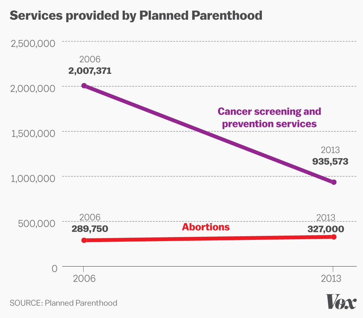
Over the past several years, Planned Parenthood has increased the raw number of abortions it provides. In 2006, they performed 289,750 abortions. By 2013, the number had gone up to 327,000. It’s possible the increase is, in part, due to the lack of alternative locations for women to get the procedure done.
Over that same time period, the number of anti-cancer services dropped from 2,007,371 to 935,573. Why the drop? Because for some services, like pap smears, there were “changing medical standards about who should be screened and how often.”
If you’re a pro-life politician who wants to use that information to make Planned Parenthood look evil, what do you do? Easy. You just have to assume your base isn’t intelligent enough to look into the details of whatever you show them. It worked with the recent anti-Planned Parenthood videos, after all.
So yesterday, during a congressional hearing, Rep. Jason Chaffetz (R-UT) showed Planned Parenthood President Cecile Richards this chart documenting those numbers:
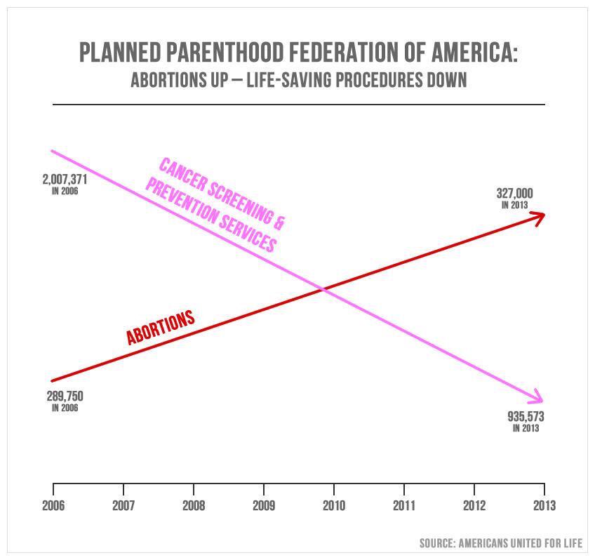
You’ll want to enlarge that image (made by the group Americans United for Life) to understand just how deceptive it is.
On the surface, it sounds like the number of abortions has skyrocketed far beyond the number of anti-cancer services… even though that’s not accurate at all. Because there are no numbers on the Y-axis, the two arrows have no relation to each other.
You want accurate? This chart, made by Vox’s Javier Zarracina, is what the chart should look like:
But that sort of honesty doesn’t fly with the anti-abortion crowd.
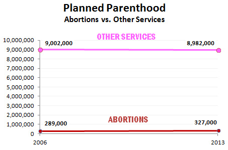
And even that doesn’t tell the whole story: Between 2006 and 2011, the number of STD treatments rose from 3,000,000 to 4,500,000. (Planned Parenthood, no matter what pro-lifers want you to think, does far more for patients than simply provide abortion services.)
In fact, when you compare Planned Parenthood’s abortion services to everything else they offer, the chart looks very different:
But, hey, when your base already has a problem accepting science, it’s a safe assumption that they won’t be able to handle math either.
You can see the actual exchange between Chaffetz and Richards below:

It’s Moving Day for the Friendly ..."
It’s Moving Day for the Friendly ..."
It’s Moving Day for the Friendly ..."
It’s Moving Day for the Friendly ..."