If you’re a pension actuary, you know that there are two pieces of data that are crucial to your valuations, for which the company experts spend lots of time and effort developing guidance. The first is discount rate — or, to the outside world, interest rate. To calculate the value of pension payments in the future, you need a rate at which to discount them to the present day. Back when I started, the lead actuary would just have a quick phone call with the client and pull the corporate bond data; now, there are, in the United States, a choice of “yield curves” and ever-more sophisticated methods (some of which tend to verge into manipulation solely to reduce costs, but that’s another story) for this assumption.
The other piece is the mortality table. Again, not long ago, the mortality table was fairly standard and one-size-fits-all, but now there are options to adjust if you’ve got a particularly healthy (e.g., white-collar/salaried) group of employees, or a particularly unhealthy (e.g., blue-collar/hourly) group, as well as the ability to project mortality, or adopt a generational table, and one of the key questions is: what is the estimated annual improvement in mortality rates (or, that is, survival rates) from year to year? The Society of Actuaries has been publishing research, and the most recent results showed a slight decrease in year-over-year improvements since the last time research was updated a couple years ago.
So I suppose I shouldn’t be surprised at this latest study, making the news today, about worsening mortality rates at midlife. The Wall Street Journal reports
Suicide, alcohol abuse, drug overdoses and chronic liver diseases largely drove the rise, which occurred between 1999 and 2013, according to the report published Monday in the Proceedings of the National Academy of Sciences. Those causes of death offset declines in other major drivers of mortality in midlife, such as lung cancer, the study said.
I also dug up an old post of mine, from pretty much a year ago, in which, after griping about October as Breast Cancer Awareness Month, and the irony that we are now so “aware” of breast cancer that the American Heart Association has had to add a second promotion, “sorry, women, you’re actually at greater risk of heart disease!”, I then looked at causes of death, stripping out deaths after 75 (after all, you’ve got to die of something eventually) and discovered that more men die of suicide than women die of breast cancer, and that ages 45 – 54, not the younger teens/twenties, are the peak age group for suicides.
Now, that being said, it did not occur to me that Poisoning, the 7th most common cause of death for men under 75 (that is, once all cancers other than lung cancer are combined together into a single cause of death), actually refers to drug overdoses.
But to see that mortality rates due to mental health and substance abuse have been rising, and so much so that, among whites in the age 45 – 54 age group, it’s more than balanced out mortality declines due to diseases such as lung cancer, and has produced a net increase in mortality — that’s really unsettling.
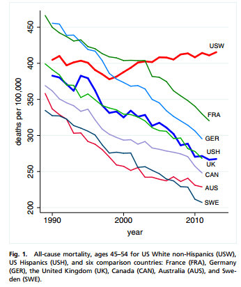
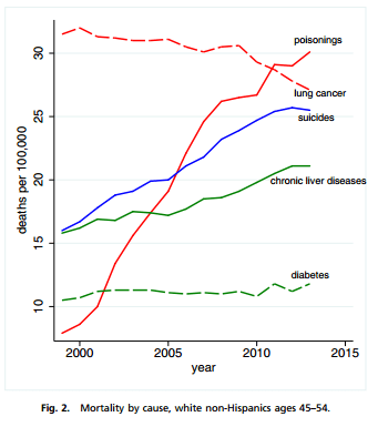
Here are the three key graphs, from the original report, “Rising morbidity and mortality in midlife among white non-Hispanic Americans in the 21st century“:
The first, “all-cause mortality, ages 45-54” shows the increased mortality rates for US-white non-Hispanics, compared to drops in selected comparison countries and for US Hispanics. Were these cherry-picked? I don’t know, but they appear to be credible comparators, and it’s particularly startling that France and Germany had higher mortality rates than the US, for this demographic group, until just after and just before 2000, respectively.
The second, mortality by cause, shows the changes over time in specific causes of death. Now, they omit heart disease and hypertension, the #1 and #6 most common causes of death (per the same interactive causes-of-death data from my prior post), since their objective is to highlight the increases in poisonings (overdoses), suicide, and chronic liver disease, and place that against lung cancer (declining) and diabetes (a greater concern in conventional wisdom).
The third graph shows the increase in mortality due to these key causes of death, for all of the younger age groups, to show that, even though only among the 45 – 54 age group was the impact so strong that mortality rates increased in total, these rates increased substantially for all these age groups.
![]()
And one more data item from the report, the key table with mortality rates split out by cause and by demographic group, whites vs. blacks vs. Hispanics, and splitting out whites by education level:
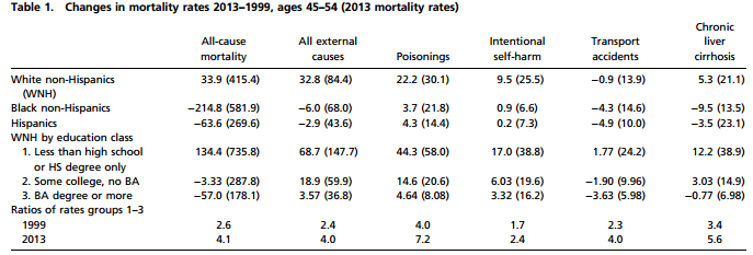
And if you look at these numbers (note that the values shown are the differences in rates, not relative changes), it’s clear that high-school diploma-only whites fared the worse by far, though even the college educated saw increases in suicides and drug overdoses.
Why are the non-college-educated faring so poorly? One quick answer that I’ve read is that the demographics have changed: more people are college educated, so that this group is shrinking, and is also a worse-off group than might have been the case in the past. But we’re talking about a very dramatic change in a very short time span: from 1999- 2013. Is the uptick in suicide and substance abuse a result of a general left-behind-ness, in the global economy?
It’s also important to understand, per the third graph above, that these trends hold true for all age groups — the 45 – 54 age group is highlighted only because the interplay of causes of death means that for this group in particular, these changes produce absolute increases in mortality. And nothing in the report states that these trends began in 1999; it’s just that in that year, mortality due to these causes rose so much as to exceed the declines due to healthcare improvements.
The report speculates that several factors could be at work: the increased abuse of prescription painkillers is comparatively recent, and survey data seems to suggest that a certain number of users/abusers became hooked after original, legitimate health/pain problems, given the rise in the number of people who are genuinely disabled or have general problems of chronic pain or ill health. (But why would this have been such an issue only in the last decade and a half?) There’s always the possibility that the economic slowdown played a role as well, especially insofar as the economy has particularly negatively impacted low-educated people. In reaction to this report, I’m also seeing comments that perhaps the decay of the family plays into this, too, what with divorced/unmarried men missing the stability of family life — after all, even though the report doesn’t split out data by sex (which is surprising, actually, and the data seems incomplete, accordingly), these causes of death are largely male. In any case, it’s also the case that the individuals who die in these ways don’t generate “ribbon” campaigns — and, what with current assisted-suicide and pot-legalization campaigns, there are even those who may exacerbate the problem by treating this as a “free choice” issue.
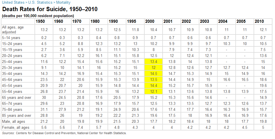
UPDATE: What was the overall historical trend in these causes of death? For suicide, actually, rates were higher in the past, and for many age groups bottomed out in the late 90s, and have been rising since then, though still not at the peak rates of the past. Here’s some data from infoplease.com, with this year-2000 trough in yellow:
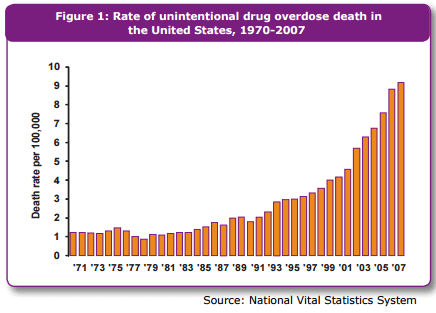
This is not so with drug overdoses — here the death rates have skyrocketed only recently, according to the CDC (this table is old but presumably the trends have continued, and I can’t find anything newer). Here’s the key chart (but read the whole link):
And these overdoses are largely due to opiod painkillers, not heroin or cocaine (though, subsequent to the publishing of this CDC material, we’ve been learning that heroin use is on the rise from prescription painkiller addicts who learn that heroin is cheaper).
So I still don’t know what to make of this, but these are compelling numbers.
FURTHER UPDATE: Another worthwhile piece to read just showed up on The Federalist, “The Crisis of the American Working Class.” The author points to changes in disability rates and definitions, but also to a cultural component:
Imagine entering your fifties and looking back on your life and seeing substance abuse, disintegrated families, distance from kids, limited neighborhoods where connections have frayed, and the humility of economic dependence as far as the eye can see, and you start to understand how the slow and the quick roads to destruction seem more tempting than dealing with the pain of life.
That lack of hope is exacerbated by the absence of belief in a higher purpose or involvement in a community of religious believers.
Not a simple answer; fact is, there are no simple solutions here.