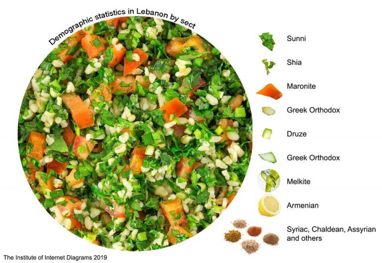
I thought I should share this chart which is more fitting and better in so many ways than a “pie chart” for depicting the religious diversity in Lebanon. I give you…the tabbouleh chart!
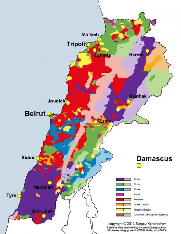
If one looks at a more literal attempt to depict the religious diversity in Lebanon, you’ll see that the above is not an entirely inappropriate representation.
The relevance of tabbouleh to getting along among the religions is also highlighted in this article.
What’s your favorite variation on or alternative to the pie chart? Here are a few that I’ve shared here in the past…