A friend and colleague shared an article on Facebook about the distorted view of the area of land masses that we get from conventional Mercator maps. This is a Peters map, which shows area accurately:
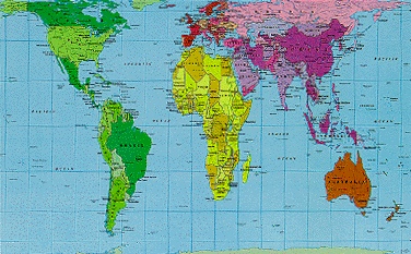
This doesn't mean that the above map is “right” and the ones that we use more often are “wrong.” A flat map depicting a spheroid planet by definition distorts. The two different map types each distorts in particular ways, in order to depict accurately in others.
The real problem is our tendency to mistake our maps for reality, to lose sight of how they are distorted by and in turn distort our perspective.
The same can be said about depictions of Jesus. Even the best “maps” of the historical Jesus are based on fragmentary reports – and unlike with the Earth that continues to be available for study down to the present day, we have no possibility of mapping Jesus' life in the way we would like. We can do quite a bit with the information that we have, but historical reconstruction, like mapmaking, involves distortion as well as depiction.
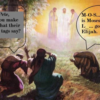
There is something useful even in the popular portrayal of Jesus as just another human being like us, too, even if the skin tones and other features are usually wrong. But if it is mistaken for an actual portrait of Jesus, then a response like this one (scribbled onto a Jehovah's Witnesses' tract) perhaps becomes appropriate: