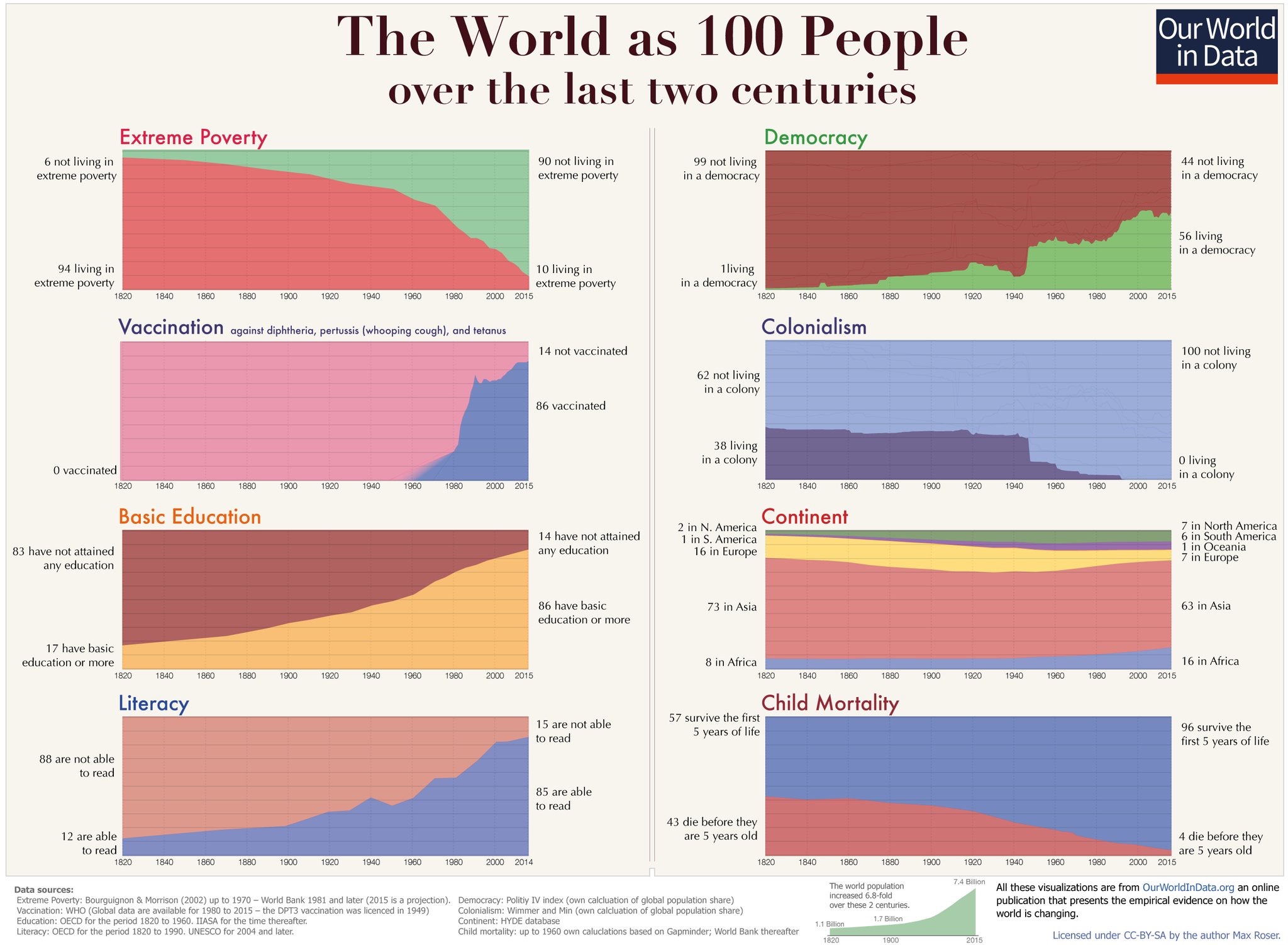
The above charts come from the website The World in Data, and more specifically Max Roser’s piece, “A history of global living conditions in 5 charts.” I am sure you have all seen past attempts to represent the world as it is now if it were 100 people. But tracing that group over 2 centuries achieves something different, in my opinion. It really does put our moment in history in perspective, in a manner that has the potential to get us to rethink our fears, our despair, and other things that make things worse when the overall trend is in a positive direction.
See also Clay Farris Naff’s post, “Make America Kind Again.”