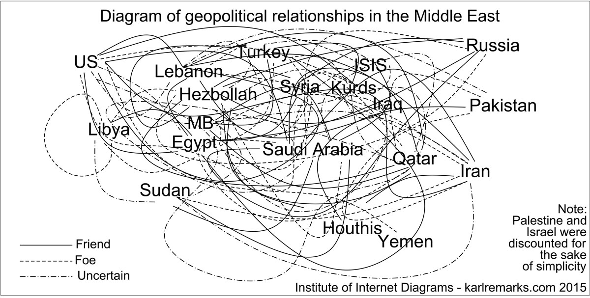
Karl Sharro created the diagram above to clarify the geopolitical relationships in the Middle East, which many find confusing. It appeared in The Atlantic together with accompanying text which, if you read it, will make things clearer still. I thought I would share it here, in case there are blog readers who struggle to grasp the precise situation.
Viewing the diagram with 3D glasses also helps.