Anyone who knows me online or in real life knows that I like to–and have always liked to–complain about the general ugliness of things. Perhaps I didn’t indulge this proclivity aloud as a child, but it was something that began to press on my conscious when we would come to America and have to go to a long stretch of highway called West Eleventh. West Eleventh was where you had to go if you wanted to buy a car or get one fixed. If you wanted to go to any number of chain restaurants–back before all the restaurants were chains. If you wanted to go to Safeway or some large store like that. It was before the advent of Walmart. Suburban America was feeling its oats, but people still wanted some semblance of particularity. And so, all the ugliest bits of the town were gathered on this long stretch of useless road. I’m sure you can immediately visualize what kind of place I am referring to because, in the intervening years between 11 and 46, all of America has turned into West Eleventh. Every town, now, has more than one. And in many cases, even downtown areas are not spared the creeping, inexorable tide of stupid and ugly buildings. It is the spiritual equivalent of driving around Walmart in a little handicapped-accessible driving cart (I don’t know what those are called). It is waking up and finding that every place is the same place and that, rather than heaven or the Shire or anywhere you might like to go, it is a soulless and vacant dystopic hellscape. How did this happen? I know that the thing about the frog being slowly boiled in a pot of water isn’t real, but is that what happened to our collective aesthetic sense? How can a country be so rich and yet so hideously ugly?
So anyway, when I happened upon this long piece a day ago I fell in love. It is a long brilliant discourse on the ugliness of our current world. It’s so hard to just pick out one thing I liked best, so you must go and read the whole thing. But in particular, I loved finally having an explanation for why architecture (too grand a name for what I have to drive by every day) has gotten to be so awful so suddenly:
A construction industry with newly decadent profit margins was ready to spring into action in the 1990s, when — after a violent, decades-long process of urban renewal and white flight — real estate developers, brokers, and local politicians started luring predominantly white homeowners and renters back to the cities they’d abandoned. By the 2000s, infill housing began to crop up in American cities that had for decades been defined by their plentiful surface parking. These residential developments were ugly, but not yet inescapable. Like the fresh-faced presidential candidate with whom it’s hard not to associate them (did every wood-and-concrete complex feature a knockoff Shepard Fairey mural, or have we been blinded by the mists of memory?), the buildings spoke to an upwardly mobile, progressive, even post-racial demographic that didn’t share its parents’ all-consuming fear of city life. Then came the ultimate stop-work order: the 2008 financial crisis.
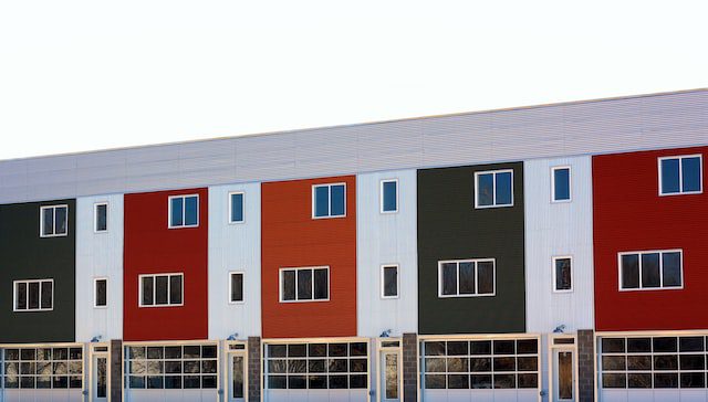
The urban building boom that picked up in the wake of the Great Recession wasn’t a boom at all, at least not by previous booming standards: in the early 2010s, multifamily housing construction was at its lowest in decades. But low interest rates worked in developers’ favor, and what had begun as an archipelago of scattered development had coalesced, by the end of the Obama years, into a visual monoculture. At the global scale, supply chains narrowed the range of building materials to a generic minimum (hence The Josh’s pileup of imitation teak accents and synthetic stucco antiflourishes). At the local level, increasingly stringent design standards imposed by ever-more-cumbersome community approval processes compelled developers to copy designs that had already been rubber-stamped elsewhere (hence that same fake teak and stucco in identical boxy buildings across the country). The environment this concatenation of forces has produced is at once totalizing and meek — an architecture embarrassed by its barely architected-ness, a building style that cuts corners and then covers them with rainscreen cladding. For all the air these buildings have sucked up in the overstated conflict between YIMBYs (who recognize that new housing is ultimately better than no housing) and NIMBYs (who don’t), the unmistakable fact of cardboard modernism is that its buildings are less ambitious, less humane, and uglier than anyone deserves.
I’ve seen lots of tweet threads full of pictures of buildings going from vaguely distinctive to all being exactly the same low-slung, soul-crushing idiocy. Mcdonald’s, for example, didn’t use to have the same exact shape and font as Wendy’s and the Blaze Pizza. I can’t find them now, but I’m sure you could if you wanted to scroll around the internet for a while. But the stupid shape of buildings isn’t the only problem we have in these latter days. The other big horror is how completely gray everything is:
The Josh’s steel railings are gray, and its plastic window sashes are a slightly clashing shade of gray. Inside, the floors are made of gray TimberCore, and the walls are painted an abject post-beige that interior designers call greige but is in fact just gray. Gray suffuses life beyond architecture: television, corporate logos, product packaging, clothes for babies, direct-to-consumer toothbrushes. What incentives — material, libidinal, or otherwise — could possibly account for all this gray? In 2020, a study by London’s Science Museum Group’s Digital Lab used image processing to analyze photographs of consumer objects manufactured between 1800 and the present. They found that things have become less colorful over time, converging on a spectrum between steel and charcoal, as though consumers want their gadgets to resemble the raw materials of the industries that produce them. If The Man in the Gray Flannel Suit once offered a warning about conformity, he is now an inspiration, although the outfit has gotten an upgrade. Today he is The Man in the Gray Bonobos, or The Man in the Gray Buck Mason Crew Neck, or The Man in the Gray Mack Weldon Sweatpants — all delivered via gray Amazon van. The imagined color of life under communism, gray has revealed itself to be the actual hue of globalized capital. “The distinct national colors of the imperialist map of the world have merged and blended in the imperial global rainbow,” wrote Hardt and Negri. What color does a blended rainbow produce? Greige, evidently.
I promise, I’m not stealing the whole thing—it’s really long. Just this one bit about ugly lighting:
Surveying a suite of candy-colored bongs, we reflect on the primacy of LEDs. (One of the bongs is bedecked with LEDs.) The shift to cold lighting in recent years was borne of urgent environmental necessity, and we accept that climate change requires concessions. We’re prepared to make those: we will eat crickets and endorse, if necessary, the blockage of the waterfront park around the corner by a giant seawall. We will even help build the seawall! Change is inevitable. But LEDs can appear in many colors, as demonstrated by our new light-up bong. So why this atomic, lobotomizing white?
Outdoors, the situation is depressingly similar. After New York replaced the sodium-vapor lights in the city’s 250,000 streetlamps with shiny new LEDs in 2017, the experience of walking through the city at night transformed, almost . . . overnight. Forgiving, romantic, shadowy orange gave way to cold, all-seeing bluish white. Again environmental concerns necessitate this scale of change, and again we wonder why, when it comes to its light bulbs, New York has chosen to back the blue. Inertia, disinterest, thoughtlessness, yes, but also the promise of increased police vigilance. Still, what is most striking about New York’s ominous glow-up is the sense that the city has been estranged from itself: the hyperprecise shadows of every leaf and every branch set against every brick wall deliver a Hollywood unreality. New York after hours now looks less like it did in Scorsese’s After Hours and more like an excessive set-bound ’60s production. The new ugliness is defined in part by an abandonment of function and form: buildings afraid to look like buildings, cars that look like renderings, restaurants that look like the apps that control them. New York City is a city increasingly in quotation marks, a detailed facsimile of a place. Gah! Blinded by the intense glare of an LED streetlamp, we bump right into said streetlamp.
Seriously, you’re going to want to read the whole thing, however long it takes you. It took me several hours because I kept being interrupted.
I don’t have a solution to this problem. I suppose the collapse of supply chains would mean we all had to start scrounging in the dirt looking for building materials and maybe then we’d regain a desire to make something satisfying to look at. That or going to church and repenting of all our sins…if you can find one that doesn’t look like a Wendy’s or a Walmart. Good luck.
Photo by Sharon Waldron on Unsplash