![]()
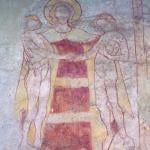
Yes, the logo for the Year of Mercy is an eyesore — and that’s if you’re smart enough to look away after giving it a quick glance. Woe betide those who look twice: they run the risk of being hypnotized. Jesus‘ limbs seem to be made of rubber. Dainty pinpricks represent the wound he sustained on the cross. He and Adam, the burden he’s carrying, have just three eyes between them, all of which look to have been plucked from a My Little Pony.
One translation of Paraclete is advocate, which means that everyone and everything deserves a good lawyer. Billy Kangas does his best to plead for the logo, but on the whole I have to agree with Tom and Simcha: the Vatican should have sandbagged it for the next time it declares a Year of Trippiness.
Since it’s too late for anyone to recall and replace the thing, we might as well rule it a minor fail and take a lesson from it: When it comes to sacred art, there are many kinds of bad. One kind shows the artist’s lack of imagination or unwillingness to engage seriously with his subject. You get the sense that he was going through the motions for the sake of a paycheck. This phenomenon probably accounts for most of the bare, barnlike churches that Katrina Fernandez loves to complain about.
Another variety of bad settles for boring and bland because that’s what the situation calls for. This would describe the entire world of Catholic kitsch. You don’t like the Divine Mercy image, or that prayer card where St. Thérèse comes off looking like a kewpie doll? Just thank Aunt Margaret for the confirmation present and stick it in a closet. You want great art? Go to Florence, cheapskate.
But there’s another kind of bad that I like to call noble bad. It results when an artist gets so carried away with his subject, or succumbs so thoroughly to the ecstasy of creation, that he ends up taking leave of his judgment. In his struggle to make whatever statement he wants to make, he takes risks he should have avoided and combines motifs, media, and colors that he really ought to have left separate.
I can think of an example of this very close to home. The adoration chapel of a certain north Scottsdale church displays the host in a portal carved from the trunk of a dead saguaro cactus. By itself, this wouldn’t be terrible – there’s lots to be said for harmonizing with the surrounding desert. The trouble starts with the Turkish rug. And the potted plants. And the chandelier. And the statues of kneeling angels, each the size of a healthy first grader.
The effect of this mix-and-match in a structure enclosed by glass on three sides has something of Vegas. It also has something of a serial killer’s private shrine. Either way, it makes the act of keeping watch with the Lord even harder than it normally is. But this is Scottsdale, the goyish Ft. Lauderdale, God’s waiting room. It’s easy to picture the furnishings being chosen by a brigade of volunteer doyennes who cheered each other on, believing with all their hearts that the knicknacks looked just darling and gave the place a homey feel.
I’m inclined to think that Marco Rupnik, the Jesuit priest who designed the logo, lost his head in a similar way. He approached the project with enormous goals, wanting on one hand to allude to the verse in Luke where the Good Shepherd carries the lost sheep on his shoulders, and on the other to depict Christ triumphant over the gates of hell. Trying to fit all of that into a single image, working in strokes broad enough to come through in a Facebook news feed, would whip anyone into a fever.
That fever could already have taken hold when Rupik went to work on the merged eye. As he told the press, he meant to show that “Christ sees with the eyes of Adam, and Adam with the eyes of Christ.” The idea may be too sophisticated to convey without words, but Rupnik’s stab is nothing if not arresting. (May one say “eye-catching”?)
If Rupnik fell short of his own goals, he did succeed in producing something that was bad in a truly noble way. Since this is the Year of Mercy, let’s all say, “Nice try.” And if he comes to visit, let’s stick his opus in a place where he’s sure to notice it.