There are many things that I have great admiration for, but perhaps one of the things I enjoy the most is seeing a long-awaited, labor of love come to full fruition. The tenacity, hard work, dedication, and pitfalls along the way in seeing something through to the end is something that, for lack of better terms, gets me emotionally invested in a project. Yet not all projects are equal and not all catch my particular attention – but if we’re truthful, that’s precisely what makes these types of things so unique. Not that it catches my particular attention, but that people have different, vested interests in certain projects due to the things they tend to have affection for. In some rare cases, that process of labor actually fosters that affection. In this case, I believe the project involved with producing Bibliotheca enraptured many along the way, even though it caught the particular attention of many immediately. For those unsure of what Bibliotheca is, it is a reader’s edition of the Bible in a more modernized version of the American Standard Version (ASV).
I have a particular affinity with this project, being a graphic designer, having worked in print production for numerous years, and having a profound love for the scriptures and books in general. It was easy for me to be wrapped up in a project like this on all fronts because it involves several things dear to me. The whole process, start to finish, is an incredible thing to behold. If anyone has stepped behind a printing press or even minimally researched the process, the historical development, and the binding of books, it is just plain neat.
The Kickstarter project took off in an incredible flurry, and though it far surpassed their initial goals, the team at Bibliotheca continued to take in orders even after the campaign ended. For any who followed the process along the two year span there were many difficulties which arose, from deciding what updates might be necessary to make the ASV more readable, ensuring quality standards did not plummet as the demand grew higher, and what to do with difficult passages such as the Pericope Adulterae, the verses following Mark 16:8, or some of the other more difficult, but less infamous textual variants like 1 Cor. 7:34.
As an aside, I sense that though the aesthetic portions of the project, being numerous and at times likely arduous, were not as taxing as the text critical portion. Why? You are taking those who through no fault of their own, are not text-critical scholars, and throwing them headlong into the field of textual criticism. This is no small task even for those who are text-critical scholars, for even amongst the various translation committees, there is no small disagreement in how to render a particular text or how to determine the validity of a portion that is contested in internal, external, and contextual witness.
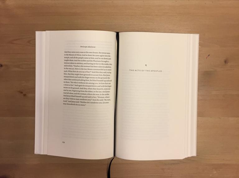
With that you have a section, like the Pericope Adulterae, included at the end of the given book. Some may not be fans of this choice, but it is nonetheless a choice made, for good or bad, by the Bibliotheca team. However, my goal here today is to argue that this series ought not to be used for the serious study of the scriptures or as one that ought to necessarily be taken at face value with text critical issues; we have better translations for this – but even the best of translations does not wholly, adequately deal with every jot and tittle. Instead, my goal is to show that one ought to appreciate this project on the scope of its intent: to be a readable, beautiful printing of the Holy Scriptures that can be paired nicely would a good cup of coffee, a reading lamp, and your favorite chair.
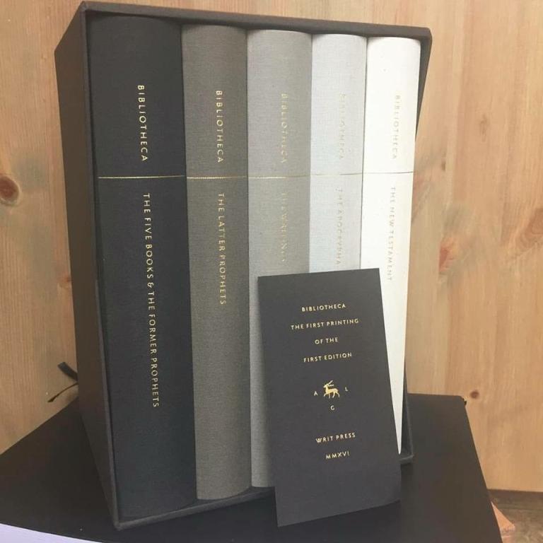
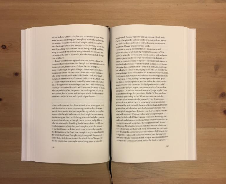
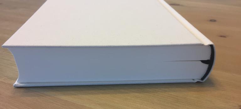
The formatting of the books is exceptional. One of the things I look for, as a graphic designer, is the continuity in a book series of the small details. My eyes naturally look to see if the line across the series of books is level; if the typeface has continuity and the kerning remains steady; if the color specifications are accurate (in this case, were the grays cooler or warmer? Is it a true black point or a full CMYK mix?). I especially look for readability, formatting, negative space, justification, etc., but in the end, I appreciate good, clean design.
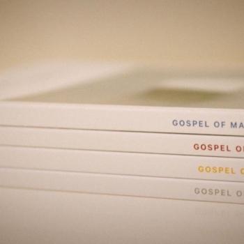
All of these things are important simply because they determine the length with which one is able to read the given book. For example, the book that uses adjusted kerning (the space between letters and words; think “newspaper”) is not nearly as easy on the eyes as the book that doesn’t. This book doesn’t adjust the kerning, allowing for prolonged reading that is easier on the eyes. Not to mention that the book is devoid of chapter and verse, and heading names as one commonly finds in most translations. Interestingly, there are still chapter divisions, they are just not as conventionally seen (or numbered). Time will tell if this is a detriment; some sections are divided horribly in modern translations, as the flow of text is often connected by a logical or inferential conjunction to the previous chapter.
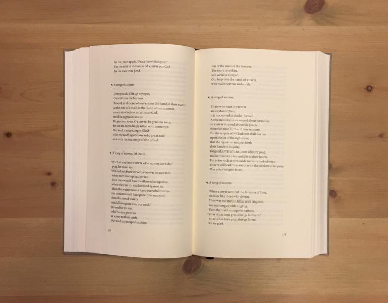
The formatting of the wisdom literature, particularly Psalms and Proverbs, is beautiful as well. At most points in this series when one encounters prose or song, the formatting hearkens back. There are undoubtedly some sections that contain prose or song that do not have this formatting – but most people don’t sense them as the Christological Hymns they are to begin with, so this isn’t entirely detrimental (i.e. Philippians 2: 6-11). However, one thing I truly enjoyed seeing was their rendering of the Tetragrammaton as YHWH.
Even the small details of the book’s functionality were not overlooked. The binding of the books is tight, yet allows for one to open the book flatly. I often find myself breaking the binding of many books simply because I can’t read certain texts in the inner margin of particularly large books, which many of my common bibliophiles consider me anathema for. The paper chosen is thick and durable, but not overly stiff, leaving it to be pleasant to the touch. Yet even the book ribbon has a small crease in it, allowing it to rest flush on the top of any particular page when closed. It is the small details like this which show the wait was worth it for any who purchased the Bibliotheca series.
I know that for many this seems overly focused on the physical attributes of the book(s) – but that is precisely what this project was started for and why I happily gave my money to Bibliotheca. For me, serious study of the Bible involves sentence diagramming in the original languages, parsing, diving into text critical issues, consulting linguistic resources, translating the passage, arguing with commentators, teasing out the historical context, understanding the passage in a biblical-theological framework, and then wrestling with how to take all of that and put it into a digestible form that is easier to access – the whole time seeking to let the text dictate meaning and challenge my existing presuppositions. That’s my goal; that is why I am going to seminary and being trained in this manner. I undoubtedly will continue in this process and refine it until the day I die.
For me Bibliotheca is not a text I will take into this process. Instead, it is a text I can sit down and read for the sheer pleasure of reading God’s Word and having a regular, saturation in the scriptures that doesn’t involve much of the same process I do for exegesis. I enjoy that process immensely, but I also enjoy simply reading the scriptures. It is a series I can pick up at night when the kids have gone to bed and read without a particular goal. I’ve long been in the habit of studying the scriptures and learning the languages has only strengthened this. I’ve long been without a simple, general reading of the scriptures and I feel this is partly due to the chapter and verse divisions, the layout of the books, the partially see-through paper, etc. Bibliotheca’s readers edition is surely not the first reader’s edition of the scriptures, but in my humble estimation, it is one of the most beautiful reader’s editions we have available to the common man.
However, it must be said: it is a beautiful work of art that is to be enjoyed, and not merely as a display in one’s house that collects dust. It ought to actually be read. Part of the love of this project is not simply deriving pleasure in looking at the books, though they are undoubtedly pristine and clean in their design, but thumbing through them; wearing the pages down; dinging the corners; taking the oils off of one’s hands and gradually giving the cover and pages that patina and old-book smell – all of which continue to add a unique character in forming a well-worn book. It is an edition to be enjoyed with all the senses, with exception to taste, unless, of course, you’re that super weird bibliophile who needs an intervention.