
So the other day, I wrote about STD rates climbing dramatically, but that post was based on the data I had had on hand that went back only to 2014. And as striking as it was, it didn’t make much sense to base any substantial comments on just five years’ worth of data. Were these fluctuations normal? Had the increases been going on for years and years? I was particularly suspicious of the various claims of cutbacks in government spending being to blame — isn’t that always the response by people whose desire is for more government money, and were there any particular cutbacks at exactly this point in time?
So I found the link to the CDC data source for more extensive historical data, and made a bunch of graphs and tables. Way too many of them, in terms of what constitutes a good use of my time, but there was a certain “sunk cost” element to it, and I really wanted to see if I could figure out anything from the data other than the vague answers that the experts and journalists give. So are you ready for a tedious number of charts and tables? (Well, tedious to me, in putting this together and into this blog post.)
Let’s start with the basic data – the relative prevalence of the three main STDs categorized together by the CDC.
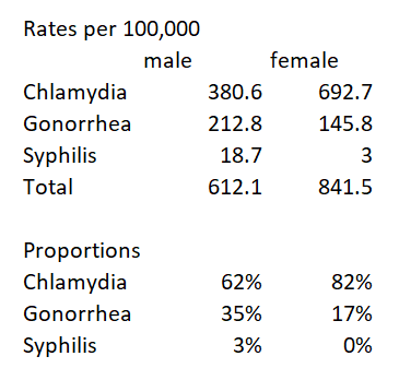
Yes, chlamydia is by far the most prevalent, and it’s a strange sort of disease, with 50% of women and 75% of men being asymptomatic (which I presume means that they don’t come in for a test because of symptoms but are identified through some sort of routine testing — and I’m not sure how they identify this for men, for whom it isn’t routine in the first place), but it impacting women’s future fertility if it isn’t treated in time (though I can’t tell from my initial reading how serious a risk this is, vs. a means of scaring women into being tested).
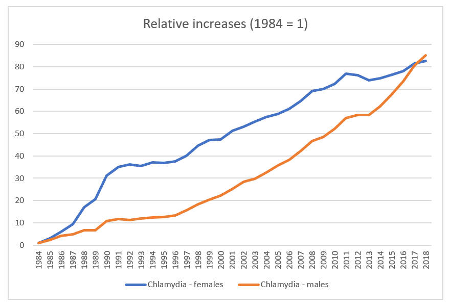
The CDC has data on prevalence going back to 1984. I’ve got two charts, one for chlamydia separately from the other two because the scales are so different, even looking at relative change since 1984 rather than rates per 100,000.
And these two graphs — well, it’s just peculiar.
The rates for chlamydia just exploded.
How much of that is because the number of cases increased so much, vs. this being the outcome of making STD testing a routine part of gynecological visits for all women under 25 and at-risk women over 25 (multiple partners or a new partner since previous testing)? And for that matter, if 75% of men are asymptomatic, and there is no norm for testing men except those who are deemed high-risk or partners of a woman who’s diagnosed, then how does their “real” prevalence compare to the new cases reported?
It’s also weird that the rates for women jumped so much in the 90s, then slowed comparatively, and leveled off starting at about the year 2010, while it was at that point that men’s rates climbed even more. And remember, these are not rates, but rates as a multiple of the 1984 rate, e.g., 80 times as prevalent in 2018 as in 1984.
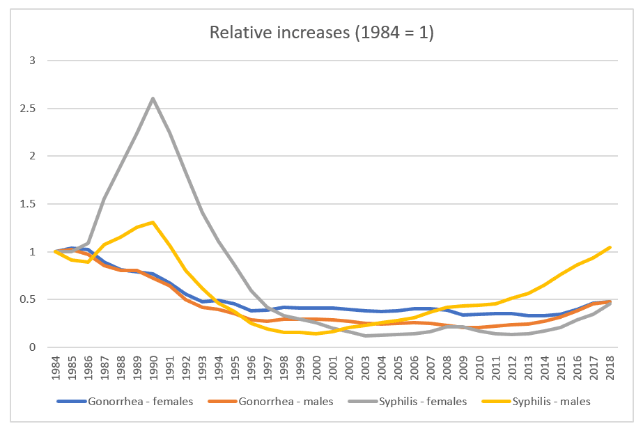
At the same time, the scale for the second chart is wonky because of the strange spike in women’s syphilis diagnoses, but then both syphilis and gonorrhea dropped significantly and stayed at fairly level rates until 2014-ish, for gonorrhea and 2011 for syphilis.
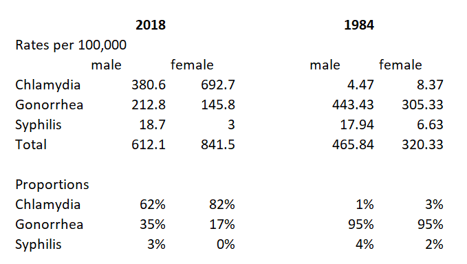
Which means that if you put the rates and proportions for 1984 and 2018 side-by-side, the results are very wonky indeed.
I am not an epidemiologist, but surely there is something more going with the chlamydia rates than merely “people need to be trained to use condoms.”
Anyway, that’s all whack enough, but let’s look at gonorrhea, or, more specifically, at the data for women. (I know that gay men make up a large number of gonorrhea cases, and I presume that much of that story has to do with fear — or lack thereof — of AIDS influencing condom use, so I don’t think they’re as useful to look at.)
To start with, here’s a summary of the statistics from my prior blog post:
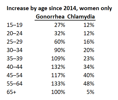
Which clearly shows the leveling off of rates for chlamydia, and the significant increase for gonorrhea — and, what’s more, the fact that for both STDs, it is at the older ages that the increase has been most dramatic, even though it is at younger ages that the most number of cases exist in absolute numbers.
Now, going back before 2014 (in terms of data that’s easily accessible) requires sacrificing the age breakdowns above age 40, because the pre-2014 data is only grouped as women 40+, and in any case age breakdowns only start in 1996.
So here are the relevant charts, which I left untouched rather than hacking off part of the Y axis.
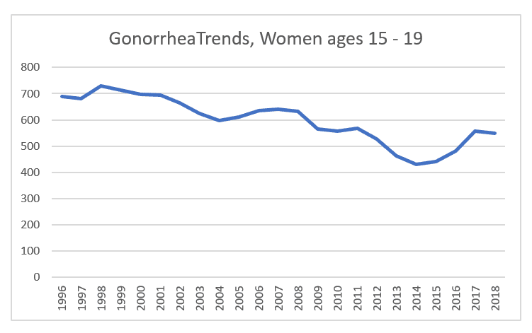
Ages 15 – 19: a slow but steady drop from 700 cases per 100,000 to a low of 430 in 2014, before bouncing up again to 550 in 2018.
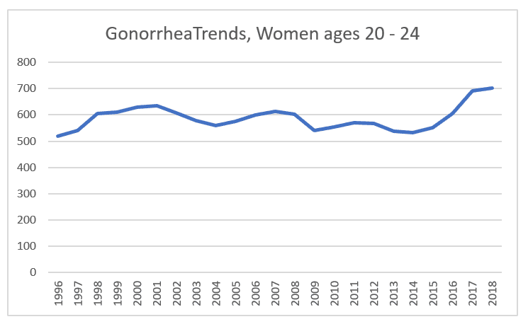
Ages 20 – 24 stayed relatively steady, in my view. A statistician would no doubt opine on the significance of these fluctuations, but I don’t see anything dramatic until the increase that starts in 2015.
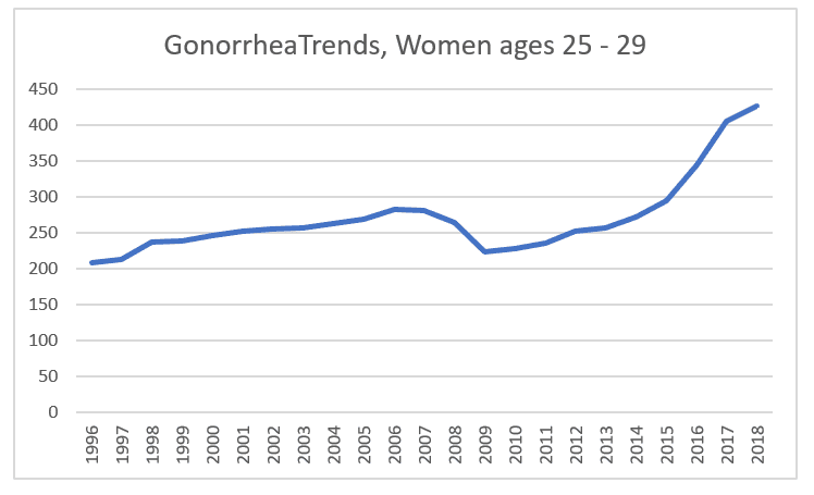
Same thing, more or less. Do you count the increase from 1996 to 2006 as significant, or as more-or-less level? What accounts for the recessionary-timed dip? More caution? If it were something that could be treated at home, vs. requiring antibiotics, I’d say that this age group, living on their own and impacted by the recession, were self-medicating to avoid copays, but I don’t see how this could be the case.
At any rate, the rates return to their pre-recession high in 2014, and increase from there.
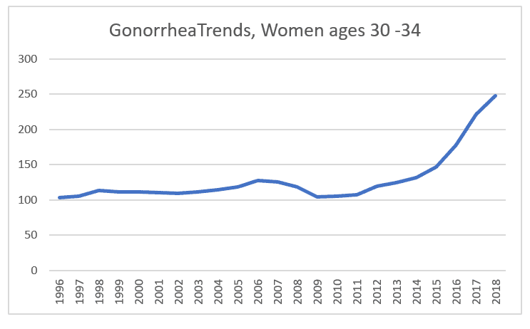
Another recession dip, though less pronounced, a recovery to pre-recession levels in 2013, and increases since then, with dramatic increase in 2016 and 2017, of 21% and 24% per year respectively.
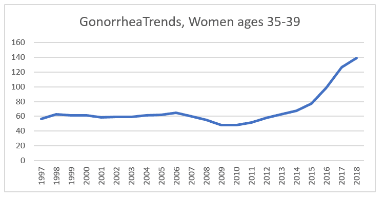
And here, too, the nearly level rate from 1997 to 2006 is interesting, followed by the recession dip and recovery in 2013, then moderate followed by dramatic increases, again in 2016 and 2017 (27% and 28%).
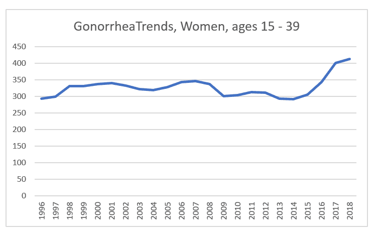
And this one puts all these trends together, causing an apparent more or less level rate from 1996 to 2014 (especially in comparison to the significant drop in the prior decade), then a rise of 4% in 2015, 12% in 2016, 17% in 2017, and 3% in 2018.
So, again, I only have guesses as to what accounts for this:
I don’t believe that it’s the usual scapegoat of “we need more services for young adults” — after all, pregnancy rates for teens and young 20-somethings have been falling dramatically, and, again, any explanation would seem to me to need to start from the very large increases for older women.
It also doesn’t make sense to say, “this is the result of delayed or no marriage for older women” when the trend is really so, so recent.
Is this the effect of Tinder (first released in 2012, massively popular in 2014) and similar apps?
Is this an effect of heavy promotion of LARCs (IUDs, implants, etc.) and the no-copay provision of Obamacare, since they are more popular among older women? Has this caused women to shift away from condoms?
Is there some element of the economic recovery finally kicking in? Do women, even if not consciously thinking about this, feel freer about taking risks when they’re doing better economically? Conceivably, the economic anxiety impacted older women harder so their response to a stronger economy might have been greater? (Note that these are not cohorts — the women in the 25 – 29 age category at the time of the recession, with the most dramatic recession dip, are now in the 35 – 39 category with the most dramatic spike.)
Is this truly a matter of empidemiology, that is, something more elementarily biological, in which the bacterium itself (which has been reported to be increasingly resisitent to antibiotics) has become more virulent?
Or is this simply a matter of the fact that testing is a “preventive care” item under Obamacare? Was there a widespread push to increase testing rates, even if it was behind the scenes, at conferences and in training sessions, so that doctors could make a little extra profit if they went beyond testing the under-25s to placing their over-25 patients into the “at-risk” category to run the tests? (After all, every doctor now screens you for depression, and I’m sure charges the insurer a bit extra for it.) To be sure, that would not explain how this could occur at the same time as chlamydia rates flattened, comparatively, but, again, these are guesses.
So now it’s really time to close out of this data file, and move on to something else. And, again, reader speculation invited!
Image: Colorized scanning electron micrograph of Neisseria gonorrhoeae bacteria, which causes gonorrhea. Credit: NIAID; https://commons.wikimedia.org/wiki/File:Neisseria_gonorrhoeae_Bacteria_(16221300454).jpg