What makes for a good book cover? It’s hard to quantify. What I love you might hate, and vice versa! But after publishing nine books, reviewing hundreds, and doing a bunch of Llewellyn unboxing videos, I think I have a reasonable grasp on what works and what does not work.
I’m not claiming that the ten (plushish) books included here are the absolute best and worst ever, just five in each category that I thought were worthy of comment.
THE BAD
Before we start with “the bad,” I laid down some ground rules for myself with this little exercise, the first being that I’m not going to pick on self published books, so only titles from major publishers. Also, my judgement of the covers is unrelated to the authors in question or the contents of the books themselves. Some of the “bad” covers contain amazing content!
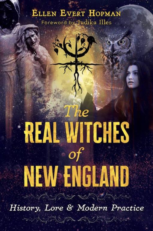
Why is The Real Witches of New England a terrible cover? Because it looks like something created entirely with public domain imagery. In fact I know that it’s created with public domain imagery because of the woman on the right. That young Witch has been in dozens of Patheos Pagan posts over the years because her image is free to use by anyone. She’s perhaps the most well imaged Witch in the world! Just awful!
What’s especially disappointing is that Inner Traditions publishes the prettiest Witchcraft/herb/crystal books this side of Taschen. Seriously check out any of the Nicholas Pearson stuff, it’s great, this is not.
I found this beauty while out with Thorn Mooney in Glastonbury in the Spring of 2022, and while I love a lot of Robin Wood art, and I generally like the Llewellyn covers of this era (as we will see) this one doesn’t do it for me.
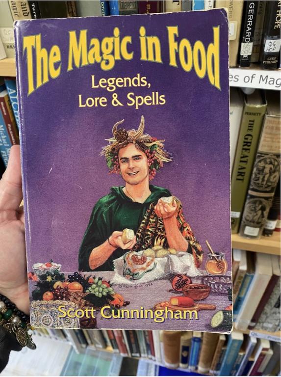
Take a look at that banquet table. Is that a log there on your right? Can’t wait to cut into that! Here’s some cheese, some fruit, and a cake! Also, look at me I’m wearing a robe with a tiger print across my shoulder to indulge in this odd feast all by my lonesome! None of this makes any sense to me.
I’m guessing this is a stock image on the bottom of the cover, and it’s not terrible image, but the more I look at it the more confused I get. Is that a mini altar? Is this person preparing to burn incense on top of their BoS? Why is that bell attached to those leaves? Maybe I think too much?
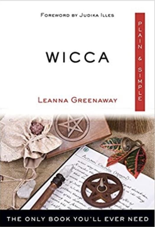
The mostly empty top half doesn’t inspire confidence either, it really makes this book look self published at worst, overly clinical and lacking in personality at best. Wicca lacking in personality!?!?! That’s crazy to me. The whole thing looks like it was put together using Microsoft Word.
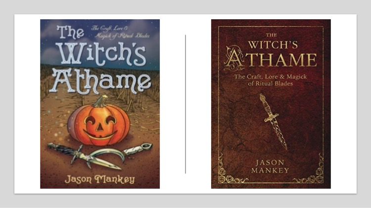
And here it is, perhaps the worst of all covers, my pumpkin book! I remember how excited I was when I got this book in the mail, New Year’s Eve no less!, with my coven coming over to celebrate that night! I was so proud of this book! (I also apparently like using exclamation marks!)
But over the next few years I heard from other Llewellyn authors that when they were asked about what they might like their book cover to look like, they sent Llewellyn pictures of my book saying “don’t let my cover look like this!” Yikes! It’s a running joke now among my peers about how much some of them hate this cover.
The biggest issue with the cover is that it doesn’t accurately reflect the contents of the book. If I had been writing a children’s book about athames or Halloween this cover would be most excellent. But my book is pretty serious, which is why it doesn’t work. The new cover is a huge improvement.
THE GOOD!
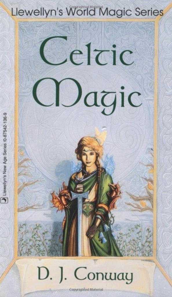
If this young woman had been real, would I have had a crush on her at age 21? Yes, yes I would have. My feelings for this book are complicated because it’s the first Witchcraft book I read as an adult. I know that parts of it are awful, but I still quote some of the ritual lines and Conway’s visualizations for things like energy are ones I still use. But we are talking about the cover . . .
So why do I like the cover? Because it’s what you want Celtic magic to look like. She could be a priestess from long long ago, or a priestess right now. She looks magical and fierce at the same time, and the trees behind her suggest rebirth because they are obviously just beginning to bloom. As a reader it suggests that you will be reborn in the cauldron of Celtic magic!
There are also the fairies and dragons clinging to her cloak and to her hair. Wouldn’t you want to be so magical that the fey simply gather every time you are near? Forget Daenerys from Game of Thrones, this was the original Mother of Dragons.
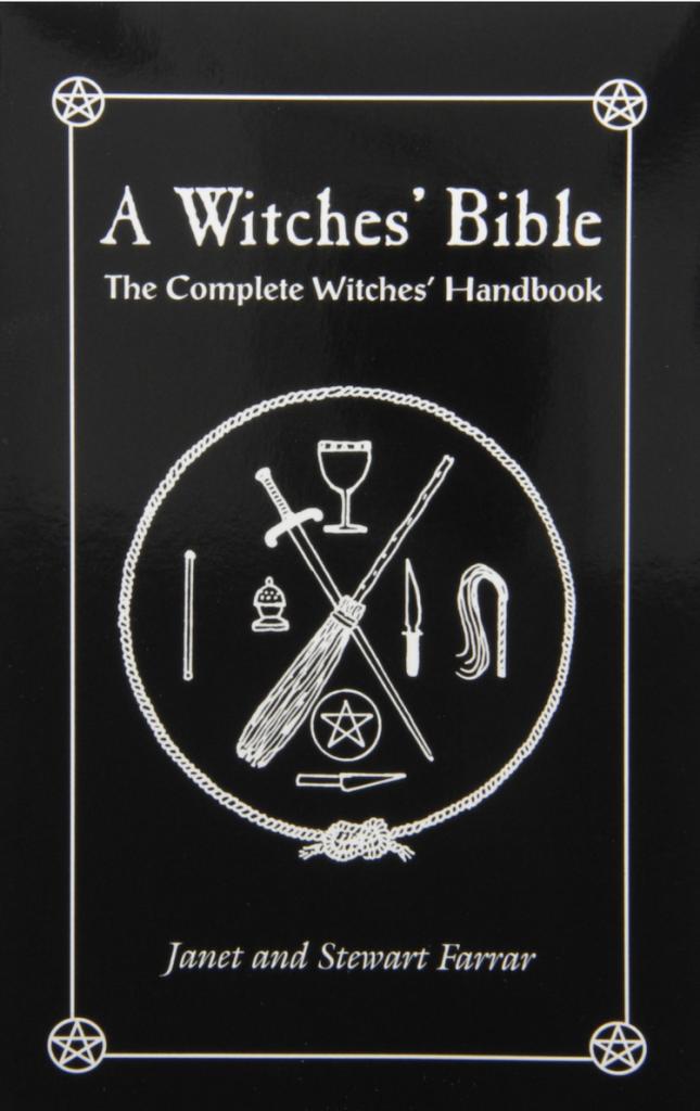
I think simple covers can be quite effective, and there are few covers more simple this one: there’s a drawing of some tools. I’ve always envisioned this as an altar, but it’s not really an altar as the round boundary is a cord. After the cord there are just a few more tools: sword, broom, chalice, wand, censer, athame, scourge, pentacle and kirfane (white handled knife, my wife tells me kirfane is never coming back as a word Witches use as much as I try).
I’ve always liked this one because it looks like Wiccan-Witchcraft is supposed to look. There’s something serious going on here, this isn’t just Witches dancing around the maypole engaging in New Age adjacent nonsense, this is magick with connections to grimoires and groups like the Golden Dawn. There’s also the suggestion of something transgressive going on with the cords and the scourge. What could those tools possibly be used for?
Also for this book to look the way it did right at the end of the Satanic Panic was a masterstroke. What is the best selling magical book of the modern era? The Avon paperback Necronomicon, due in large part because it looks like something you shouldn’t read. Instead of going after the sunshine and light Pagans here’s something completely different! This was what I wanted a Witchcraft book to look like.
Runner up in the same sort of category . . .
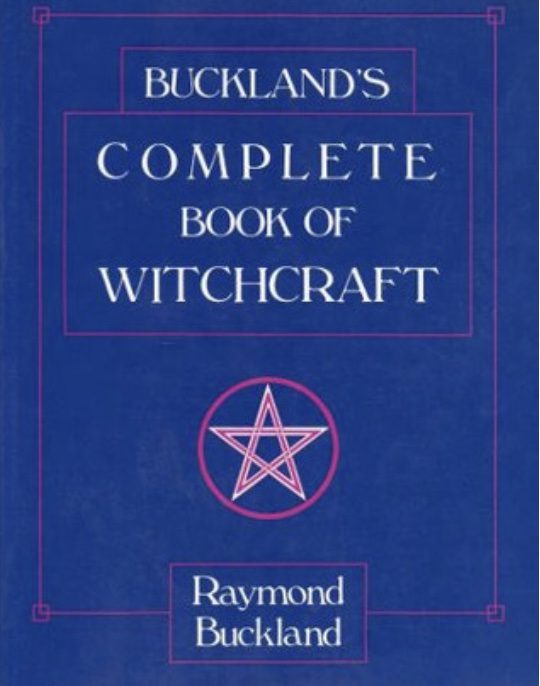
Not quite as striking as the Farrar’s book, but this conveys what it needs to convey. I always thought this cover looked like a cross between a grimoire and a late elementary school workbook. The latter is exactly how the actual contents of the book are laid out too.
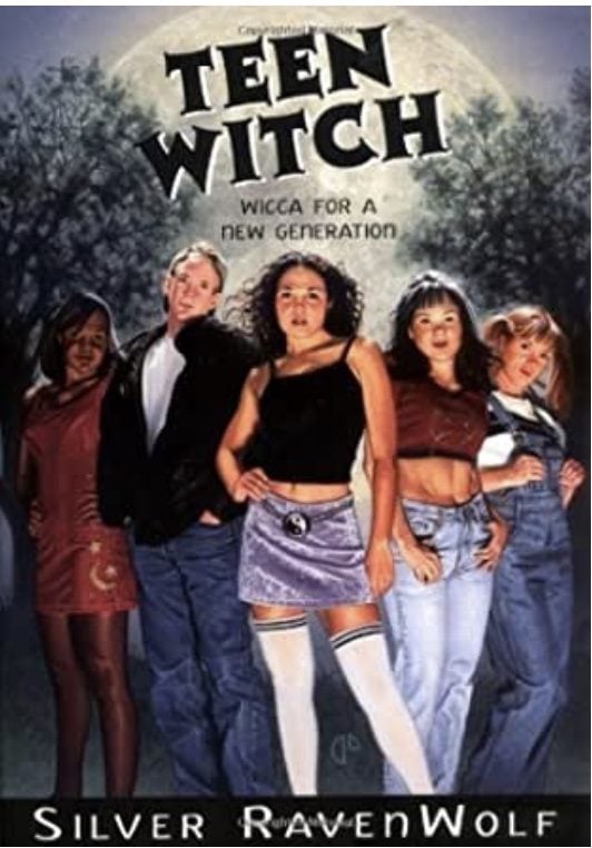
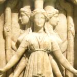
Bethany Salem’s yin/yang symbol has not aged particularly well, and I’m confused about the outside temperature. Our guy here is wearing a heavy jacket and jeans, the young woman on the right has on overalls, and Bethany is wearing a shortish skirt and a sleeveless top? I guess her socks are long? But I still can’t help but think she along with the other young woman with her mid-drift showing and the young lady in the back wearing a dress are cold. Despite these caveats I like this cover because it looks like teenagers being teenagers behind a fallish background. The cover shouldn’t look like something for adults, it should match the YA fiction its adjacent too.
I’ll never be over Llewellyn getting rid of their “classic covers” for the Ravenwolf books. I love the covers for Broomstick, Cauldron, and Fire along with this. I thought I’d do a deeper dive into this books and it’s many covers too, because the original is no longer available (unless you buy used of course).
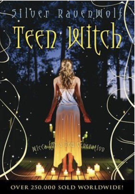
It’s sad that we just get a skinny white girl on the second version of the cover, but what she’s doing is probably more accurate as to how most teenagers practice. I know my wife used to do solitary candle spells/rituals when she was 16 for instance (though probably not on a wooden back deck adjacent to a forest, most of us aren’t that lucky). It’s also less cartoony, which was probably necessary the way covers were moving at the time.
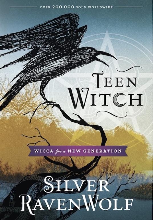
It’s weird that the third version of the book proudly announces that it has sold less copies than the second. This cover reminds me of the Tales of Beedle the Bard cartoon in the first part of the first Deathly Hallows movie in the Harry Potter franchise which was probably the point. Gotta keep these things contemporary. Also, the lack of people on the cover makes it feel more inclusive, like you don’t have to look a certain way to get something out of this book.
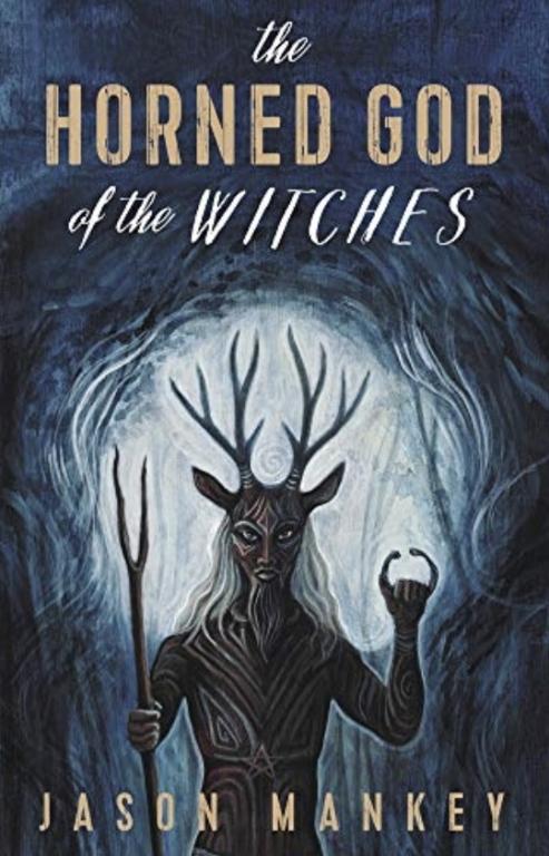
After beating my own book up earlier, here is one of my book covers that I actually really like. It helps of course when you have Laura Tempest Zakroff draw the cover, like a lot helps! But I love how ol horn head is depicted on the cover.
For whatever reason when I look at the face of this Horned God I see the actor Djimon Hounsou (there’s a link there if you don’t know who that is). Then there’s the long blonde hair, which Tempest put in as a nod to me which is pretty awesome, funny, and flattering. Also on that head are the antlers of a stag and the ears of a goat! We get both Cernunnos and Pan here because of it. He’s carrying a stang and a torque, connecting him to Traditional Witchcraft and the distant past, and then that star in his middle is representative of Wicca. He slips in and out of the shadows, and yet he lights the way. I love this image so freaking much.
I also like the fonts on the cover, not so much how my name looks, but the contrasting colors and fonts in the title. Horned God stands out and is flanked by “The . . . . of the Witches.”
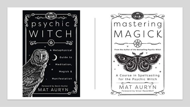
Everything about the cover to Psychic Witch works! The fonts are on point, the images are on point, and the simple black and white imagery is really eye catching. I love the owl, but I really love the understated eye at the top of the cover. Mat rules!
The cover to his next book is equally great, and matches his first book.
There’s that eye again I love so much, but instead of being a mostly black cover this time we get the mirror image. You know that it’s still Mat, but that it’s an entirely new offering. I’ve written so much s#$t now and for a variety of series which means my books are half a dozen different sizes and looks. I so wish Transformative Witchcraft and The Wheel of the Year looked similar, because they are really books that compliment each other well. Oh bother.
But yeah, Mat’s covers are the best of the last ten years I think.
Find Jason Online
My Patreon Starts at Two Bucks!
The Witch’s Book of Spellcraft
The Horned God of the Witches
Transformative Witchcraft: The Greater Mysteries
The Witch’s Wheel of the Year: Circles for Solitaries, Circles, & Covens
Raise the Horns on Facebook Jason’s Twitter
Pictures Of Magickal Stuff
Witch With Books Podcast
The Horned God of the Witches
Transformative Witchcraft: The Greater Mysteries
The Witch’s Wheel of the Year: Circles for Solitaries, Circles, & Covens
Raise the Horns on Facebook Jason’s Twitter
Pictures Of Magickal Stuff
Witch With Books Podcast
The Witch’s Wheel of the Year: Circles for Solitaries, Circles, & Covens
Raise the Horns on Facebook Jason’s Twitter
Pictures Of Magickal Stuff
Witch With Books Podcast
Pictures Of Magickal Stuff