The Facebook page “S**t Academics Say” shared two images, which I am passing on below. One is a diagram from Nature about the ways that academics use Twitter. The other is a PHD Comic about the real uses of Twitter by academics. I'll give you the latter first, then the original from Nature that it is based on.
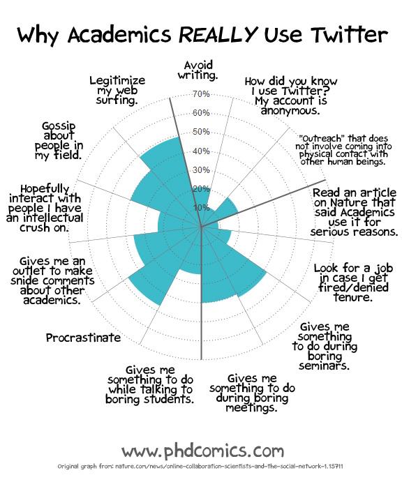
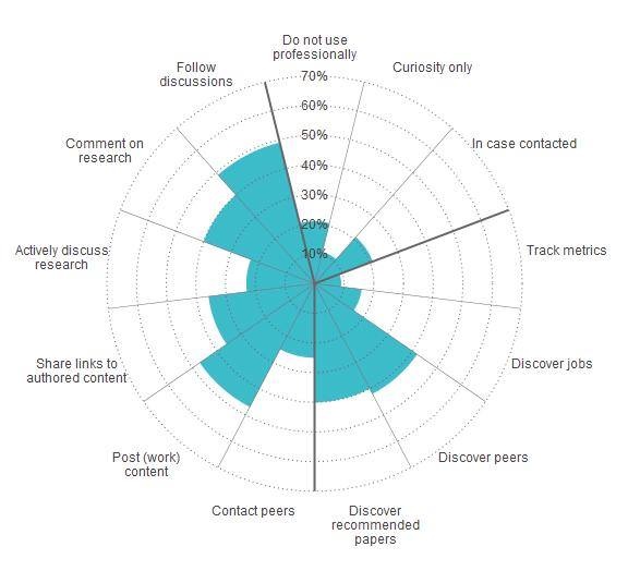
Which fits your experience better?