You might not think there’s magick in graphic design, but you’d be very much mistaken. The whole purpose of good design is to draw the eye, get people involved or interested, and create some sort of successful interaction from it all. While graphic design may not exactly be spellcraft (though you sure can work some sigils into it, or apply colors in a sympathetic manner), it can be a vital thing to the business of Witchcraft – and Pwordism in general.
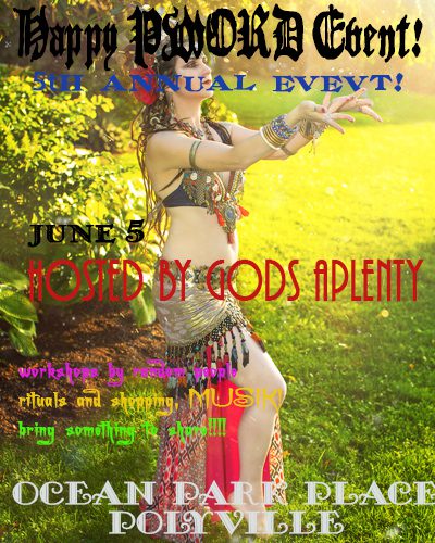
Want people to know about your event? It needs a good graphic, an easy to read flyer, something that captures the eye and gets people to read. It needs to be distinctive, yet clean and attractive. It also needs to seem current to your target audience. Unfortunately, a lot of the event flyers and ads I’ve seen recently look like they’ve taken inspiration from 1990’s websites a la geocities gif-frenzy/graphic overload. As if the mode of thinking is: more is more, and better if you can’t actually read the thing. Witchy does not mean include every magicky graphic ever.
I’m not going to embarrass anyone by pointing out their flyers or websites. Heck, I’ve had a few over the years that I would prefer to delete from the design folder of history. I could make a tumblr of bad design examples that would keep me busy every day for years. Let’s not focus on that. Instead, let’s start making some awesome ads!
I can’t claim to be on the cutting edge of what’s hot in graphic design (I’m 20 years past school for that, though I’m good at spotting trends) – BUT I know what works, and have some simple guidelines to follow. So if you have an event or shop or thing you want to promote, and are going to fire up Photoshop, paintshop, gimp, word, or whatever you use to make a flyer, here’s some tips to follow that will steer you well.
(In no particular order, they’re all important):
Use no more than 3 fonts on a single piece of advertising. That includes your logo. So if you have a name logo, that’s one font. Then you could choose an additional font for headlines, and one more for text/small print – that is easier to read. And you’ve hit your limit. Sans Serif fonts (like Arial, Helvetica, Verdana) are best for small type, as they’re clean (think “sans decoration”). Serif fonts are fancier, so they are more for grabbing the eye. Look for fonts that are easy to read versus look cool. Cool points don’t matter if you can’t read it!
Do not use busy graphics as your background image. Yes, that is a lovely picture of faeries tripping, unicorns jousting, or naked maypole dancing – but don’t use it behind your text. Nobody can read anything you put on top of it, no matter what color you use. It hurts the eyes and makes people less likely to keep reading.
If you do use an image, make sure you have permission to use it. “I found it on google image search” does not mean it’s free for you to use. Ask permission of the artist/photographer/designer, or invest in stock images. Don’t be that jerk who says “well, easier to say I’m sorry…”
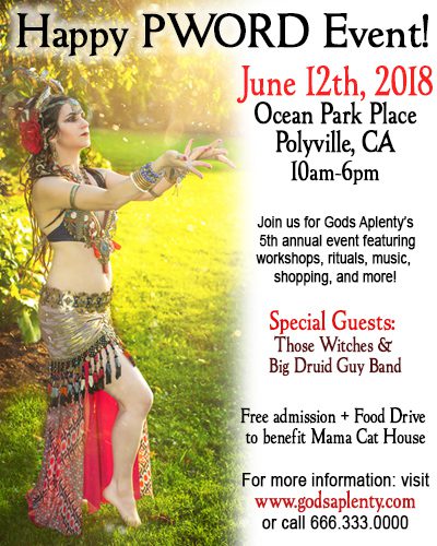
Does your ad satisfy the who/what/when/where/why? Meaning if it’s an event, who does it involve, what’s happening, when and where is it happening (day/date/year), and any other important details (website/email/complete phone number/reservations/tickets/etc). Especially for things on the web – put city/state! If it’s get spread, then people can know where it’s happening, and share it in the right places.
Consider your color scheme. If you want something to stand out and “vibrate”, use complementary color variations (blue/orange, yellow/purple, red/green). You can also do mainly monochromatic (one color) with a pop of something else to catch the eye. If you’re looking for something more harmonious, choose analogous colors (they’re next to each other on the color wheel – check out the link for more color theory help).
But KEEP IT SIMPLE. Too much text/information makes it hard to read. If it’s a flyer, direct them to a website or phone number where they can get more information. Don’t repeat text over and over. More graphics is NOT better. Less graphics make it more attractive to the eye and easier to read. White or open space is totally OK!
For the love of the gods, SPELLCHECK and PROOFREAD. Are you bad with typing stuff out and your layout program doesn’t let you know if you’ve made a typo? Then put all of your text first into a document of some kind (Open Office has a great collection of free word/spreadsheet/presentation programs you can download), check the spelling, and then re-read it to make sure it makes sense. Then read it again, and again. Then have something else look at it again. Then read it out loud to your cat. That helps.
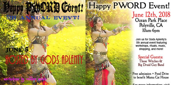
The following examples I created in about 10 minutes (total). Photo is of me, by Carrie Meyer of The Dancer’s Eye. I could go back and tweak them more, but they’re a quick example of what not to do, and what to do. Obviously one is much easier to read and has most, if not all, of the relevant info on there. Basically, the right combination of elements equals the right ingredients to a successful design – just like magick that works.