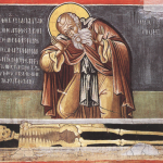
Although some of my fellow Patheos writers might disagree with me… I really love the new logo for the Year of Mercy. I think it’s a great image and one that I would proudly display over most church-related logos.
Here are 10 reasons why.
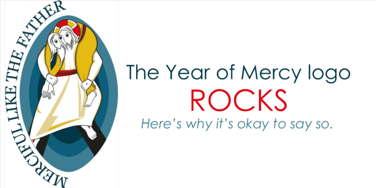
- I love the icon style
This picture is based off the traditional style of byzantine iconography. I have written about my love of this style many times before (Exhibit a). It’s a style that is designed to draw you into the imagery, to be a little odd, and to have a theological slant. This kind of image is often spoken of as being “written” not just “painted” because it seeks to communicate something. I like that. In fact I love that. It’s something that needs to be kept in mind when looking at the picture, because almost all the choices that are made with this image are done so in the visual language of the iconographer.
- I love the reminder of Christ’s role in mercy
I like that Jesus is central in the image. I have spent a lot of time working in ministries of mercy. I have lived and breathed in the social justice world. Far too often when people talk about the work of mercy in the Church, the importance of Jesus gets lost. I can’t tell you how many meetings I’ve been to with Social ministry organizations where they have asked me to come up with a scripture to justify what they are doing and I have had to remind them that the scripture is what should have grounded their decision in the first place.
- I love the motif of being carried
This picture picks up on the Luke 15:5 where Christ compares himself to a good shepherd who seeks for a sheep and ”And when he finds it, he sets it on his shoulders with great joy.” This is so often what I have needed. I need to be carried. Both when I am being served and also when I am serving. The strength of God in Christ is what we need to do the work of God in Christ. We need to be reminded of that.
- I love the resurrection imagery
One of my fellow pathos writers compared the black things at the bottom of the image to “skis.” This is funny, but I think they are one of the highlights of the image. Take a look at an icon of the resurrection. Jesus is standing on the gates of hell, having defeated sin death and the devil. These gates form a cross, which tells us about the tool through which this work of redemption has been accomplished. This is a pose of both love and victory. I love it.
- I love the text choice “merciful like the father”
We are called to be merciful like the father, and I am so glad this was brought up. Jesus tells us that his life is a demonstration of the father’s love. We are not called to write our own agenda, but are called to join in the agenda of God. Even Jesus submitted his ministry to the Father’s will. We are called to do the same.
- I love that it’s just odd enough that people might ask me about it
This image is a little odd. Many have noted its strange features. I love that part of it. I’d love to wear a shirt with this on it. Or have a sticker with it. It’s the kind of thing that raises questions. It’s the kind of image that starts conversations. It’s the kind of image that I can see as opening up doors to share the gospel with people. I love it.
- I love the blue background.
This blue background is common in many icons of Christ. It reminds us of the heavenly life of Jesus, and points us to the eternal life which is our destiny. Often times this blue oval is used to depict the work of the victorious Christ. It’s powerful that this image is used to demonstrate mercy. It is like we are being taught that Jesus’ very life and victory are experienced in the act of caring for one’s neighbor. Powerful!
- I love the merging of Christ in the face
Jesus shares the face of both the served and the serving in this image. This is important because we know that Jesus is found in both the servant and the served. In Matthew 25 we read that Jesus is hidden in the hungry, thirsty, sick, and naked. It’s good to remember that. My own work to serve others is greatly inspired by remembering that Jesus is found in the face of those I serve, and that in serving I begin to look a little more like Jesus. - I love the color scheme
the blue background of the image reminds us of the heavenly life of Jesus. The red belt is a reminder of his earthly intervention. In Byzantine iconography red represents the fire and energy of the Holy Spirit which is seen at work though God’s intervention. Jesus Christ is the greatest expression of this work, but it is the power that we also seek to have as we put on the belt of truth (Ephesians 6:14) in our work. Jesus is clothed in white, which proclaims the victory of the resurrection. The yellow is the color of the garment Christ often wears as he is placed in the tomb. The ministry of Christ’s humility unto death and his resurrection unto life are both present. The black is for sin death and the devil, which Christ stand upon, having conquered them. - I just like it and you can too
The reason I wrote this article is because I feared that people who read the articles teasing the image might not want to use them. I hope this is not the end result. I think the image is one of the coolest logos I have seen in a long time… I hope that you all can understand more of why I like it and can see the beauty in it every time you see it.