Is it just me, or do the cartoons on the Walt Disney Treasures and Looney Tunes Golden Collection sets seem a little too tightly framed at times to any other collectors out there?
I mean, for starters, here are a few of the title cards from the brand new Disney set, More Silly Symphonies: 1929 – 1938 — and note how the MPAA logo is sometimes cropped at the bottom, and how there is sometimes almost no space between the words “Mickey Mouse presents” and the edge of the frame at the top:


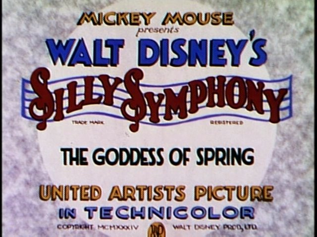
Incidentally, The Goddess of Spring (1934) was originally released on DVD five years ago as a bonus feature on the “platinum edition” of Snow White and the Seven Dwarfs (1937), which probably explains why that particular cartoon fills the DVD frame (though it still cuts off the MPAA logo!) whereas virtually all of the other cartoons are slightly masked; standards have changed since then.
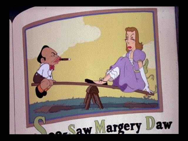
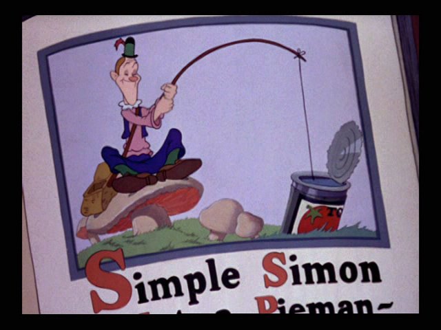
Then consider these frames from Mother Goose Goes Hollywood (1938) — noting how the nursery-rhyme titles are cut off:


Then consider this bit from Three Orphan Kittens (1935) — noting how the blue cat seems to be cut off at the bottom:


Or consider these frames from later in the same short — shouldn’t we be seeing a little more of the ground in these shots?:


Then consider these frames from Broken Toys (1935) — noting how the Stepin Fetchit puppet’s arms are barely in the frame, even though they are supposed to be controlling all the action:


Then consider these frames from Cock o’ the Walk (1935) and Merbabies (1938) — noting how they seem to crop the faces more than you might expect, whether at the top or at the sides:


I could cite other examples, but I think these will suffice. I suppose it is possible that cartoons really were animated like this way back in the 1930s and 1940s, but somehow I doubt it.