This article was originally published before the election using 2008 maps. Here are the brand new updated 2012 maps from Mark Newman.
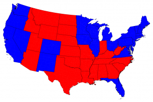
 Typical red-state-blue-state map of the 2012 presidential election results
© 2012 M. E. J. Newman
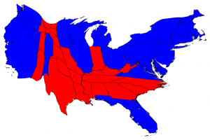
 Red-state-blue-state map of the 2012 presidential election results with surface area altered to represent population
© 2012 M. E. J. Newman
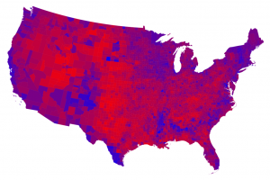
 County map of the 2012 presidential election results using shades of purple to represent vote
© 2012 M. E. J. Newman
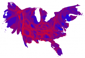
 County map of the 2012 presidential election results with surface area altered to represent population and using shades of purple to represent vote
© 2012 M. E. J. Newman
If you find this all as interesting as I do, you can see the original article with more maps here.
See the 2008 maps here.
Return to the article here.
