… This is supposed to be a Catholic logo for a Catholic event, right?
The World Youth Day 2016 logo has just been released! #wyd #krakow #krakow2016 #wydusa pic.twitter.com/iiYaFDs44K
— World Youth Day USA (@WYDUSA) July 3, 2014
Yay, Poland.
Boo, Logo. It’s ghastly.
It looks like something that should be hot glued onto a felt banner.
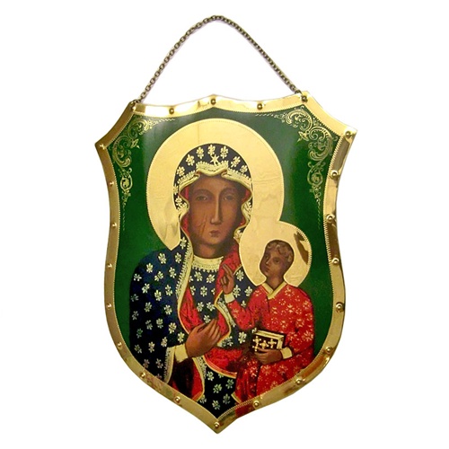
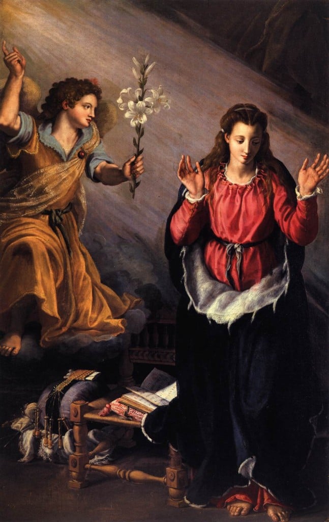
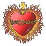
And has a generic protestant-y look to it. It’s not like the Catholic Church isn’t swimming in rich symbolism and heraldry to pick from. Why this? And it’s Poland, for goodness sake… the most Catholic country in Europe. Why couldn’t the logo be, I don’t know, a little more appropriate.
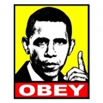
There. I fixed it.

