© 2012 M. E. J. Newman

© 2012 M. E. J. Newman
See all four 2012 maps together here.
There is so much suggested and influenced by the shorthand terms “red state” and “blue state”: the ideological hardening of “right” and “left,” distortions in our electoral process, and further distortions caused by the way news agencies report on it. You get the impression you must choose a camp. Are you red or blue? Worse, it sets up the other color as an opposite, with no overlap. It sets up people who have chosen the other camp as Other, creating division and weakening our sense of oneness with other people and the world around us. If I’m “red,” is someone in a “blue state” my neighbor?
Seeing states as red or blue is rooted in our electoral system. I don’t think our system is wrong necessarily, but it has caused a perception problem. The electoral college is designed to mitigate potential issues with direct democracy; it overweights rural areas and turns broad but shallow victories into landslides, like Reagan’s lopsided electoral win in 1980 where he took 44 states in the electoral college, masking a popular vote win of only 50.7%. It was a solid win — Carter only got 41% in the three-way race — but nearly half the American people voted against Reagan, many of them with very strong feelings about it, and the electoral college result gave the impression that he had a mandate, that the entire country was behind him and if you weren’t you were out of step.
In recent years, the red-blue shorthand tells us that we live in a country divided into Republican red in the middle and south, and Democratic blue in the Northeast, northern Midwest and West Coast.
But this impression is based on a lie built into the approach of looking at aggregates and winners — an approach used throughout our society, and especially in politics and sociology. If two-thirds of the people like dogs more than cats, for example, it will be reported as “most people prefer dogs.” This isn’t true. Get three people together and odds are one of them prefers cats. That means in any family, at any cocktail party, there are likely some cat lovers. This tendency to make broad statements and lump people together in camps runs deep. (I made up those pet popularity numbers. If you want the real answer, you can go here.)
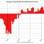
A state is red on the typical map if the Republican wins by even one percent, but the reality is that many voting districts in that state may have voted blue, and many voters in the “red” districts voted the other way.
The best illustration of the lie behind the red-blue divide is this wonderful election results map developed by physicist Mark Newman, of the University of Michigan’s Center for the Study of Complex Systems, which uses a shade of purple representing the ratio of red to blue in each county and adjusts its surface area to represent population.
© 2012 M. E. J. Newman
It’s just as interesting but not as extreme if you don’t alter the surface area for population. You can see that version, a red-state-blue-state version with the surface area altered by population and all four maps next to each other, and a link to more information here.)
This cartography is part of an emerging area of science that includes network theory, complexity science and big data, which is changing the way we see and understand complex systems and massive amounts of information. In this example, the red-state-blue-state map oversimplified the presentation of the data to the point of altering our understanding of it, creating a false sense of clarity, while we now have the ability through this map to take in a much more accurate representation of its complexity. (I’ll be writing more about big data in the future.) As you can see clearly from this approach, we live in a country not of red and blue states, the twain never to mix, but rather in a purple country filled with districts of varying hues.
In this map, there are only two nearly solid red Republican swaths. One over much of Utah, and another crossing Nebraska, Kansas, Oklahoma and northern Texas; while Democratic blue is in big blobs around major metropolitan areas in the Northeast, Mid-Atlantic, Midwest, Pacific Northwest, California and along the Mississippi. The rest of the country is mostly shades of purple.
(Of course if you grew up in the opposite party of a primary-colored district, it might have felt like hostile territory. I know a little about how that feels; I was raised in a vehemently anti-communist anti-union Republican household in one of the bluest places in the country, New York City’s Greenwich Village, home to honest-to-goodness communists.)
And beyond how individuals vote is the fact that they rarely agree with that candidate or party on all issues. There’s nothing wrong with party affiliations, but reducing people to nothing but red or blue, Republican or Democrat, conservative or liberal, encourages them to think of themselves that way, suppressing or denying or talking themselves out of positions that contradict “their” camp’s collective beliefs. It leaves out any serious debate. Those who disagree with a camp’s current positions and don’t leave are seen as illegitimate or foolish. Like Maine’s pro-health care reform Republican senator Olympia Snowe, who has decided to leave the Senate; Utah’s former pro-immigration reform Republican congressman Chris Cannon, who was driven out in the primaries for that heresy; or Ron Paul in general. This narrowing of party ideologies has been enforced within the parties and amplified by all the one-sided talk radio and 24-hour “news” channel chatter.
At the same time though, there’s plenty of evidence that people are fed up — just look to 2008 candidate Obama’s popularity, to the support for Ron Paul, and to the Tea Party and Occupy movements despite the fact that they contribute to the problem too.
Remember this truth: that nearly every town, city and patch of farmland in the country is “purple” — a mix of neighbors, friends and family, good people each of whose own mixed political preferences tip the scale to vote for one side or the other in a contest. We are not reducible to red or blue. Don’t let yourself be. Nor are candidates or even parties. Nothing is as black and white as red and blue.
Click here to see all four 2012 maps next to each other, and a link to more information.
This article was originally published before the election using 2008 maps. You can see them here.
This post was originally published on September 4, 2012.