Happy Halloween, folks! As a graduate student, I am contractually required to enjoy nerdy humor, including geeky holiday decorations and nerdy costumes. This past weekend at a Halloween Party I cribbed my costume from a joke on a mock journal paper.
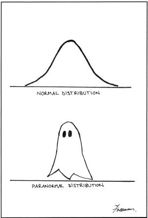
I dressed up as a ghost, but drew a Gaussian distribution and the equation for it on the front.
One of my other favorite pumpkins is the following one (which is supposed to be the scariest pumpkin to a researcher looking to get significant results).
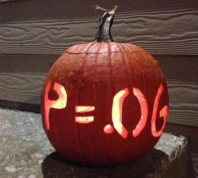
This particular Jack O’ Lantern has made the rounds the past couple years, and I still chuckle at it.* However, there is another design that I hadn’t seen until now popping up on my Facebook and Twitter feed. It may be an old image, but by the nature of the internet and meme culture, it’s difficult to find the original source, and it might be a few years old. Either way, it’s new to me, and hopefully the readers will find it as funny as I do.
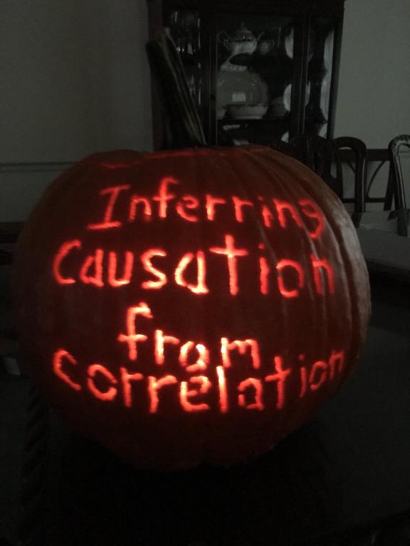
Obviously, this is a cheeky reference to the maxim that “Correlation does not imply causation“. Obviously, just because data sets correlate does not mean that one phenomenon caused another. There is a humorous website called Spurious Correlations that is dedicated to finding unrelated data sets that happen to match up to drive this point home. If you look at this website and take the correlations seriously, you might come to the conclusion that high amount of cheese consumption increases your chances of dying by being tangled in your bedsheets. Or, you might think that a higher number of computer science doctorates in the US increases video game arcade revenue. Obviously, these are absurd statements, and the site is good at driving the point home that we can’t just look at data and infer that one causes the other.
This pumpkin is a joke, one that I found pretty funny. However, I love being pedantic to the point of ruining jokes, and I have to say the pumpkin is inaccurate. When we are using inductive reasoning (which is all of empirical science), we have little choice but to look at correlations and draw conclusions from them. If you wanted a thoroughly accurate Jack O’ Lantern (the best kind of Jack O’ Lantern), then the pumpkin would say “Inferring Causation solely from correlation”.
There are obvious applications of looking at correlations to determine causation. You can look at a linear regression for the redshift of stars as a function of distance from Earth as evidence that the Universe is Expanding (and use that linear regression to subsequently calculate the Hubble Constant). You also can look at how chemical rates change as a function of temperature, and subsequently determine that (in a first-order reaction) an increase in temperature causes a chemical reaction to increase in rate as an Arrhenius Relationship. What helps here, though, is that for both of these examples there is theory supporting them. In the former case, Einstein’s equations of General Relativity imply that the universe is expanding, and that stars that are further away will appear redder as a function of how relativity and waves interact. In the latter case, Svante Arrhenius had a history of kinetic theory to work off of and the progress of previous research like that of van’t Hoff that showed that chemical activation energy has something to do with the transition from a chemical reactant to a product.
It’s part of a scientists’ job to discern whether or not certain correlations are valid or not. One way to do this is through control experiments. For example, perhaps I wanted to create a well-mixed vessel for a chemical reaction, and I put it on an agitator to shake up the batch. A poorly made agitator might heat up by shaking more, and this heating might cause the chemical reaction to create undesired byproducts like a non-useful ash. If a higher stir rate caused the agitator to increase in temperature, then this rate of undesired byproducts may increase. If I were careful, I would notice the increased temperature of the agitator as a function of stir rate, and try to find a better agitator that insulated its moving parts better. If I wasn’t careful, I could come to the erroneous conclusion that stirring the chemicals more created poor byproducts.
However, the increase in temperature aligns very well with chemical understanding due to how chemicals interact at various temperatures. There is, in other words, a causal link between the temperature of the agitator and the reactions involved in the vessel. If the scientist were to graph the temperature of the vessel alongside the composition of the products at the end of a reaction, they may be justified in having data that accurately characterizes the reactions within their system.
This shows why scientists are necessary, and why scientific discoveries are likely to never be automated (until superintelligent robots rise up and destroy all humans to create a society for themselves). It takes a good understanding of why these models are correct to understand these correlations. The data in correlations is incredibly useful, but as a tool we have to make sure we are using it correctly. If we simply look at a correlation to imply that A causes B, then we are using that tool clumsily and incorrectly. If we completely rule out using correlation to imply causation, then we aren’t using that tool at all.
One of the most popular erroneous examples that people bring up when illustrating the problem with drawing correlation from causation is that ice cream consumption and the murder rate correlate very well. I’ll go straight to the punchline and bring up that there is an external factor that affects both, the seasons. Ice cream is more popular in the summer than in the winter, and more people interact and are out of the house in the summer compared to the winter, increasing the probability of a hostile interpersonal interaction. This model for how they correlate makes a lot of sense after the fact. But let’s assume we had no clue how any of these factors interacted. Let’s assume we are aliens just arriving at Earth with no understanding of frozen delicacy preferences, homicidal human tendencies, or Terrestrial season changes.
All three of these factors seem to go together, so then it is our job to find out what they have to do with each other (if anything). Could murder sprees cause people to physiologically desire comforting food like ice cream, which causes an increase in carbon gases that change the temperature? Could ice cream increase our rate of violent hormonal rage, and decaying bodies increase the number of greenhouse gases? Without much prior information, there actually wouldn’t really be any way to know the causal chain between the three factors involved. We could rule out the former by looking at cultures that don’t have ice cream, and we would still see a similar trend in murder rate. We could also look at regions along the equator where temperature doesn’t change that much over time and see how that affects crime. These controls would allow us to rule out different factors. As we look at how different factors play into each other, the trend becomes a lot more clear. Once we understand how temperature changes throughout the year in many places and how that affects what treats people enjoy and how we interact socially, we understand a lot more.
Of course, we have to remind ourselves that none of these correlations are ever absolute in science. There is always the slightest possibility that we are wrong and we haven’t ruled out all the proper factors, and that our findings are mistaken, and that’s ok. But that doesn’t mean we can’t use this tool, as long as we are using it properly and considering all the factors properly. We do often show that correlation implies causation, but that can only happen when we have a causal link established, or when we have additional information that supports our case.
In real life, pretty much everything we learn is based on inductive reasoning, and thus we have no choice to deduce causation from correlation. And for the most part, it works. We know from experience that we have to have a hot pan to cook our egg, but we also know that increasing the heat too much will burn it. We learn what temperatures are comfortable for us and when we need to put on a jacket to go outside. Pulling causation from correlation is a necessary part of inductive reasoning. The fun part of empirical science is being extra rigorous about it, and making sure that we trim the fat off everything and make sure that our reasoning is valid.
Henry from MinutePhysics recently put out a fun video that explains this in an entertaining way, and perhaps a bit more clearly. Perhaps you will enjoy it.
*There are lots of problems relying on p-values to establish significance, which I opted not to cover here. The use of p-values can be exploited or not tell the whole picture. Here’s a good piece that describes some of the problems.