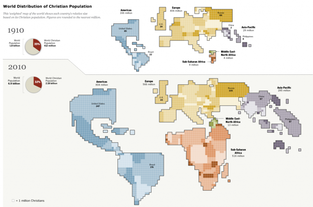
Okay, this maybe the coolest map I’ve seen of the spread of Christianity worldwide. From the Pew Center, it compares the distribution of Christianity today versus a century ago, and it does with a spatial-weighted map. While the percentage of the world’s population that is Christian has dropped a bit (35% to 32%), the big change is in where Christians live. In the map, the larger the country, the more Christians live in it. Look what’s happened to Africa and Asia-Pacific. This sea-change in the nature of Christianity has many, many implications that we have and will experience for some time to come.


