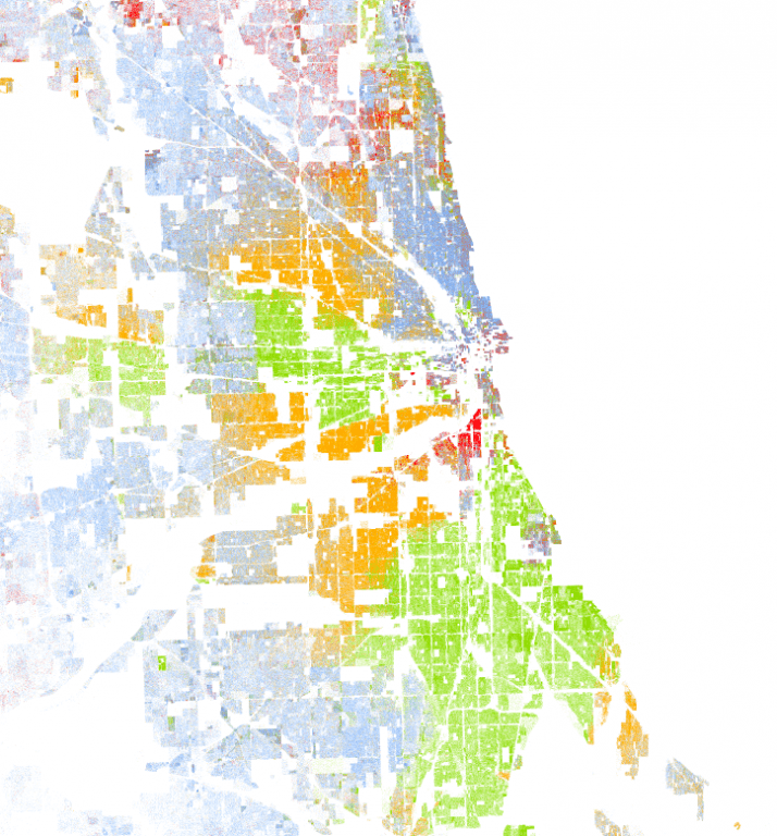
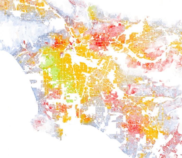
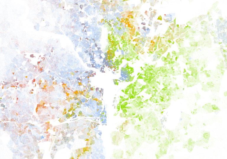
The University of Virginia used the 2010 census to create a map of the U.S. overlaid with different colored dots—one dot for each person. The map uses blue dots for white people, green dots for black people, orange dots for Hispanic people, red dots for Asian people, and brown dots for Native Americans or other racial groups. The map is utterly fascinating, especially when looking at cities, because it demonstrates the level of segregation that exists in most places.
That one, above? That’s Chicago.
That one, up there, is Los Angeles.
And that one, of course, is Washington, D.C.
The level of segregation illuminated by these maps is sobering in and of itself. But there’s something even more sobering to be found in the racial dot map.
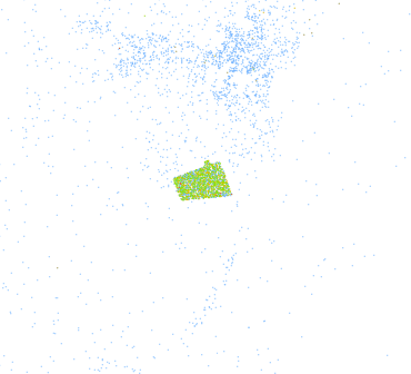
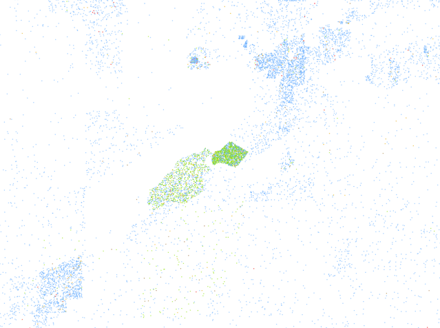
While browsing through some rural areas, which are mostly made up of open space and blue dots (white people), I began to notice something odd. I kept finding random collections of green dots (black people) in weirdly delineated, concentrated areas.
Here’s an example:
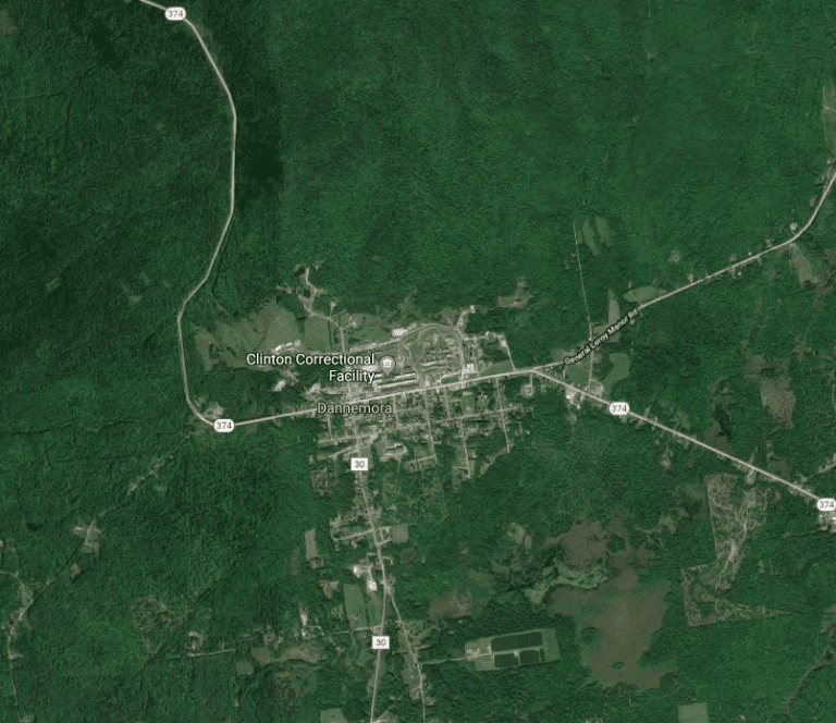
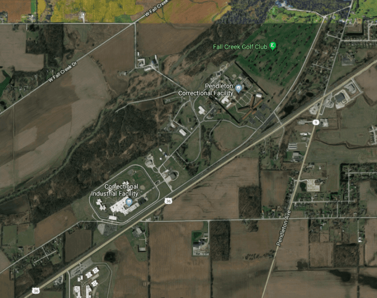
What was that? It seemed odd. So I pulled up Google Maps and located the area—this is a more difficult task than it sounds, as the racial dot map has no place labels, so you have to go by shapes of cities and their relative placement.
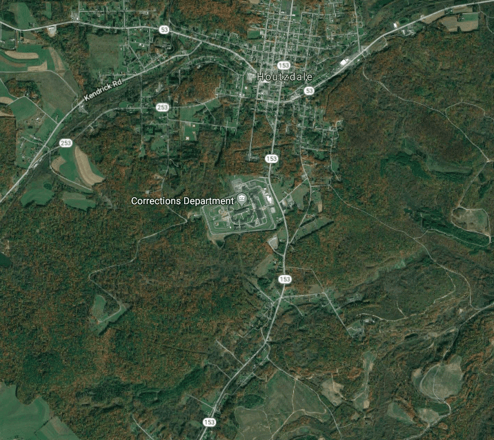
This is what I found:
That’s right—that odd concentration is a correctional facility. And this is no isolated incident. I found it again, and again, and again.
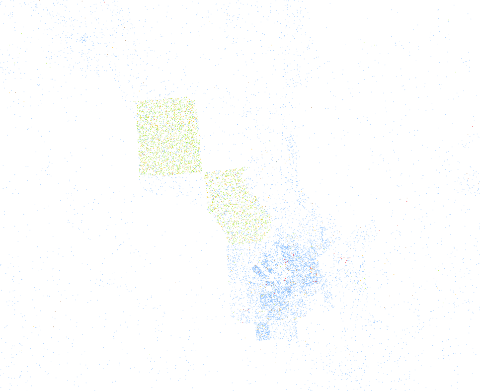
Look at this weird shape, for instance:
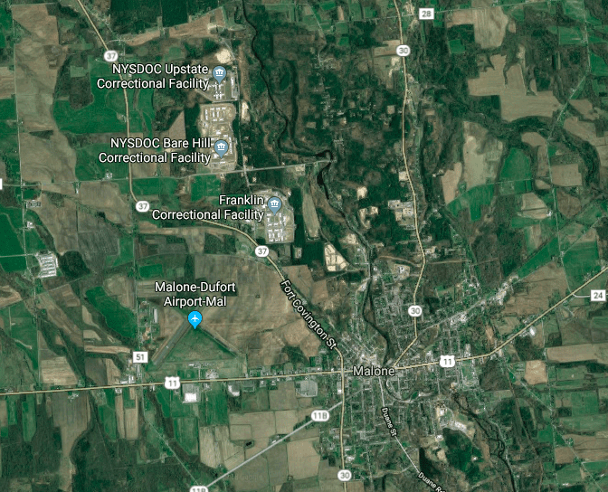
And, here is what I found on Google Maps:
Even this slightly less concentrated area looked odd, given its straight edges and weirdly intersecting corners, so I decided to look it up:
And, yep, there it is again:
I pulled up case after case, and each time I was able to perfectly predict where a correctional facility was on located, based only on the odd concentrations I was finding on the racial dot map.
Remember, I didn’t start with a list of correctional facilities and then go through the map checking them. I started with the racial dot map and that alone.
When activists talk about the criminalization of the African American male and the need for prison reform, this is what they’re talking about—an imprisoned population so racially unbalanced that you can find the locations of correctional facilities on a map that shows only demography, and nothing else.
Have a look at the map yourself—-you may notice other things as well.
I have a Patreon! Please support my writing!

