I really want to thank everyone for the tone of the replies so far. Some of the comment threads elsewhere on the internet have gotten a little unpleasant, but over here, it looks like the regular readers are taking this with mostly civil anger. Which is a totally reasonable response. If you’ve been reading this blog for any length of time, you know I have a lot more respect for people who do pick fights when the stakes are high than “Oh, everyone’s entitled to their opinion” types. Ideas have consequences, so it’s weird to say you can somehow be disinterest in other people’s beliefs. I look forward to wading back in to the comment threads and fleshing out my position a little more, but I’ll be mostly catching up on email today.
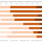
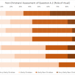
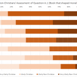
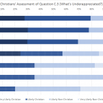
But never fear, I’ve got something even better than apologetics on offer today: data visualization! After looking at my excel charts for the latest round of the Turing Test, commenter Mark offered a redesign if I sent him the spreadsheets. And after seeing what he did with them, I can tell you my next conversion is going to be being a Tableau enthusiast. Go check it out!
(and for the more recent readers of the blog, check the Ideological Turing Test tab for more information about what Mark charted. Basically it’s a chance for atheists and Christians to see how well they understand the way the other side thinks by trying to impersonate them. Here are links to the Christian and Atheist rounds from this year, along with the answer key. Plus some contestants gave us a behind the scenes look at how they wrote their entries.).