Some time today, BoltBus WiFi permitting, I’m going to take one last look at the statistics you need to know to parse the link between the Pill and breast cancer that Marc of Bad Catholic alluded to in a post earlier this week. The first post went through some common misunderstandings of the ways risk and percentages are used by epidemiologists. Today’s post will go over some of the questions and objections that came up in the comments.
If you’re planning to get into these kinds of discussion, I really recommend going over these posts, or you’re going to get caught out by a statistician. Even if you’re confident you understand the statistics, you’re going to have to be able to explain them to a lay audience if you want to be persuasive.
You can trust me on this. Need I remind you that, for my birthday, Tristyn of Eschatological Psychosis created this striking portrait of me:
(Yeah, it’s statistics/data themed this week)
Want to make sure you don’t go wrong again? Check out the Guardian‘s Science to English dictionary. They’ve put together a list of technical terms that have very different meaning colloquially. Theory (as in of Evolution or of Gravity) makes the list. So does positive trend, error, bias, and manipulation. So brush up if you’re not familiar with the technical usage or use the list as a reminder to be more careful about explaining when you talk to people outside your field.
If you read my epidemiology posts and looked over that chart and have realized you’ve been misusing statistics, you should know you’ve got a lot company. But now that you’ve leveled up your math-fu, perhaps you’d like to do a little bounty hunting?
A New Zealand website runs a weekly competition to find the worst assault on statistics and quantitative reasoning made by a NZ publication. The winner nets $20.
But here’s one science article that definitely wouldn’t be in the running for a bad stat prize. When Blackberry started having massive outages across the US and Europe, some statisticians thought to check whether the forced decrease in texting would make an impact on accident rates. Turns out, while the network was down, traffic accidents fell by 20% in Dubai and 40% in Abu Dhabi.
And once you’ve got interesting data, the next awesome thing you get to do is figure out the best way to communicate your data. If you’re interested in doing that graphically, I’ve got two great links for, both written at lay level.
- Jacob Harris of the NYT exposes the ubiquitous word clouds as meaningless at best, deceptive at worse for the Nieman Journalism Lab.
- Matthew Ericson (also NYT) explains that not all data that can be broken down into geographic regions should be displayed using a map. (With many helpful examples!)
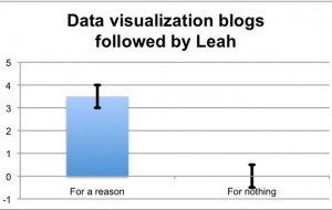
That last earned Ericson a spot in my Reader feeds, so I guess my friend Dylan will have to update the graphic he made for me:
(It’s a visualization of my comment: “I don’t follow three to four data visualization blogs for nothing!”)
But when it comes to data visualization, are you really going to better than the just-announced winners of the Dance Your Ph.D. contest?
For more Quick Takes, visit Conversion Diary!


