This Grantland profile of water parks is (as far as I can remember) the most exhilarating thing I’ve read this summer. Lots of fun mechanical details about how slides and rides are built, both in terms of literal mechanics and in terms of the way they shape a park experience. Plus, the people profiled are, well, a bunch of characters.
At first glance, George Millay was an unlikely man to invent a slacker’s paradise. He was ex-Navy, a staunch conservative, a reactionary. “A lot of us thought of him as our General Patton,” said Dick Evans, who worked on an early feasibility study for Wet ’n Wild. Millay kept a carving of Attila the Hun behind his desk. In letters to friends, Millay referred to the Japanese as “Japs” and the Cold War as the “World Bolshevik Expansion.” His birthday was the Fourth of July.
Millay hated long hair. It was the badge of the nitwits who wanted America to lose in Vietnam, a generation that was taking the country straight to hell. … [Once,] Millay walked into a bar, sat down, and told the man next to him: “You have a beard. You don’t belong in this restaurant.” The man ignored him. Millay stood up. He warned the man he had been a boxer at UCLA. The man rose, coldcocked Millay, and walked out of the bar. That was George Millay: a man who’d offer to fight on behalf of civility.
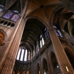
Speaking of the design of buildings and building-like structures, Julien Meyrat has an interesting piece for New Geography on “Why Modern Architecture Struggles to Inspire Catholics.” The article begins with an email dialogue between the author and his brother, prompted by:
…the opening of a new convent and Visitor Center buried into the hill on which sits Le Corbusier’s famous Notre Dame-du-Haut Chapel at Ronchamp. The convent was but the latest creation of the contemporary master Renzo Piano, featuring architect’s trademark manipulation of natural light, spatial simplicity, open views of nature and elegant detailing. My brother seemed to shrug at these qualities, writing:
Seems more like a fish tank with Ikea finishes than a cloister. I know natural light, rectangles, and windows are nice, but its openness and simplicity feel like some vapid unbearable lightness than a place of spiritual reflection. Zen monks might appreciate it more.
I replied that he seemed to have a very narrow idea of what constitutes a proper place for spiritual reflection, and that lightness and simplicity had a place Catholic doctrine. I referred to him to a series of pictures I had taken of Le Corbusier’s monastery, wondering what he thought of his more ‘Brutal’ approach. My brother elaborated:
Ugh, these architects have no god. That thing (by Corbu) is hideous. Look, meditation takes place in the mind, but more in the soul. Christianity places the priority on man’s soul transcending his surroundings, not blending with it (a la Zen). Man is large, not small. Churches should be ornamented and highly symbolic, teeming with life, not stark and barren. It all has to do with Being not Nonbeing. The church is a foundation, it’s heavy, it imitates the eternal. It’s not some flimsy plates of glass and concrete garnished with random primary colors here and there.
Meyrat works through a number of examples (with illustrations) to show how design can have theological significance. I’m not sure if I agreed with every assessment, but this is one of those articles that certainly expanded my vocabulary of analysis and perception.
The next link is the most fun I’ve ever had with Brutalism. A game developer named Cedric built these gifs of expanding and contracting Brutalist buildings, animated by a few simple rules for growth. (There are more at the link)

(The Brutalist church I attended in Berkeley remains terrible, though).
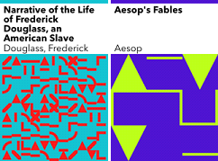
And speaking of neat uses of rules and programming to make art… that’s how the New York Public Library solved the problem of its missing covers. The ebooks that they have of books that predate the 20th century tend not to have covers, so it’s hard to make them stand out in the online catalogue. Cue an algorithm.
10 PRINT was the starting point for my next ebook cover generator. In 10 PRINT a non-alphanumeric character is chosen by a random “coin toss” and displayed as a graphic. In my cover generator, a book’s title is transformed into a graphic. Each letter A-Z and digit 0-9 is replaced with its PETSCII graphic equivalent (e.g. the W gets replaced with an empty circle). I used Processing to quickly create sketches that allowed for some parameter control such as line thickness and grid size. For characters not on the PETSCII “keyboard” (such as accented Latin letters or Chinese characters) I chose a replacement graphic based on the output of passing the character into Processing’s
int()function.In order to have a variety of colors across the books, I decided to use the combined length of the book title and the author’s name as a seed number, and use that seed to generate a color. This color and its complementary are used for drawing the shapes.
The books wind up looking like this:
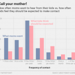
In more fun data news, 538 has a great profile of Christian Rudder the president of OkCupid and author of Dataclysm: Who We Are (When We Think No One’s Looking). I did not know that he also played in a (successful) rock band and acted in Frances Ha.
To make these [OkTrends] posts, it would take Rudder weeks to sort through the data his colleagues provided. He’d hunker down with a huge data set, load up Excel, and, as he puts it, “embrace the darkness.” “I’m very grim when I’m doing this stuff, as I’m sure you could imagine, and it’s just something about the grimness. You just live in it, man. If I have one talent it’s the ability to sit in front of anything, whether it’s Pro Tools or Excel or some postmodern novel or whatever it is, and just, like, do it.”
P.S. the 538 interview is titled “Matchmaker, Matchmaker, Make Me a Spreadsheet” which delights me utterly, as did SlateStarCodex’s recent “Matchmaker, Matchmaker, Make Me a Map” listing of rationalist blogs (which I was pleased to be included in).
A big huzzah for Math with Bad Drawings who, in his words:
I had a whole, scathing essay written and ready to go.
The title: The SAT Changed Their Guessing Policy to Appear Fairer, But It’s Actually Less Fair. “With the ACT pulling ahead in the admissions test Cola Wars,” I wrote, “I struggle to greet the SAT’s announced changes with anything but cynicism.”
I was halfway into the boxing ring when I realized I was on the wrong side of the fight.

His explanation of why he changed his mind, but I’m most pleased with his humility about realizing he had to.
Using the last Quick Take to post about Halloween progress (and thus be forced to make some) has been pretty helpful so far. This week, I cut and assembles the outside part of the bodice. (I have the sleeves-ish too, but it’s not time to attach them yet).

I also went to the fabric store this week to pick up fabric for the lining and collar/cuff accents, so the goal is, for next week, to have all the equivalent lining pieces cut and assembled that I currently have above. And, I’m scheduled to go to an electronics meetup on Monday to get some tips on… an element of the costume.
For more Quick Takes, visit Conversion Diary!