The following commentary comes from Dr. JD Donovan. His credentials follow:
Dr. JD Donovan received his BS degree in Chemistry from the University of Notre Dame and his PhD in Biophysics and Theoretical Biology from the University of Chicago.
*Always pursuing interdisciplinary topics, he has worked in university departments ranging from Physics to Physiology as well as industrial basic research developing new technologies for diagnostic testing. As a teacher, he has served mostly in small liberal arts colleges where he presented courses that span the sciences, from evolutionary biology through chemistry to cosmology. His special joy, though, is to lead courses that explore the interface between science and humanities. His enthusiasm for teaching comes through to his students who voted him runner up for teacher of the year at the University of Florida, and to his college president who nominated him for the Carnegie Foundation’s US Professor of the Year Award. He recently retired from academic life (in his own words, he’s “a recovering academic”) and was appointed Professor Emeritus at North Central College in Illinois.*A practicing Catholic, he has served in various ministries in his parishes over the years, particularly in liturgy and in Peace and Justice committees. He also has special devotion to St. John of the Cross, St. Theresa of Lisieux, and Servant of God Dorothy Day.*JD has tried to put both his faith and his analytical side to good work. Among other things, he is a founder and Past President of his local Habitat for Humanity affiliate, Past President of HFH Illinois, founding member of the Waukegan School Board Ethics Committee, and Past President of Waukegan Main Street.*Finally, JD is a member of the American Physical Society, the AAAS, Institute for the Theological Encounter of Science and Technology, and the Society of Catholic Scientists.
Though this email may seem critical, please consider it instead as a teacher helping his student with his statistics homework.
After reading your first post on March 24th about coronavirus deaths, I went to the source that you linked to (I was not aware of it, so
thanks) and started doing some analysis.
I agree that there is reason for hope, that social distancing is working, and the curve is flattening. But it’s not for the reasons you give; the growth in daily deaths does not yet show signs of leveling off. I’ll explain why, but first, let’s talk about other hopeful hints in the data that I see in my analysis, and then turn to the daily deaths data.
As you’re aware, an epidemic first has an exponential phase which can’t go on forever: all epidemics eventually peak. When looking at cumulative data (whether new cases or deaths), the graph over time first curves up, then becomes straight, and eventually levels off and stays there. If you go to the Johns Hopkins website, the China and S. Korea data illustrate this very well. You can see those curves by selecting those
countries and looking at the graph of confirmed cases on the lower right of the screen. The part of the graph on the left that curves up is the exponential phase, the straight part of the graph is the linear phase, and the flattening is the final phase.
That language was kind of vague so first let me clarify what “exponential” and “linear” mean beyond the vague words “curves up” and “looks straight.” A theologian (you) knows as well as a scientist (me) that precise definition is essential.
A linear graph increases by the same amount each day. For example, if a curve goes up by 100 each day, it gives a straight line. By contrast, an exponential curve increases by the same percent each day. For example, if a curve goes up by 24% each day, it goes up more and more each day and doubles every 3 days. When we look at that, we say it curves up.
Now the hopeful thing for me is that in the US data, the graph of confirmed cases in the lower right, appears to be entering the linear phase. It’s approaching a straight line without being upwardly curved any more. This jibes with the graph on the daily increase tab of that same chart in the lower right. The daily increase in confirmed cases is leveling off, giving almost the same number of new cases each day, though it has not yet peaked. As I explained to my adult daughter yesterday, it isn’t the beginning of the end but it does indicate the end of the beginning. I suspect (but being a scientist, I will wait for more data before saying so definitively) that the daily increase in confirmed cases will peak this week, which will cause the cumulative confirmed cases curve* to begin slowly leveling off. There is light at the end of this tunnel.
Now, let’s look at the deaths data. Because deaths from Covid occur about a week after case confirmation, one would not expect deaths to enter the linear phase until about a week after cases themselves did. Regrettably, the linked website does not give a graph of the deaths, only the confirmed cases, but the data that you’ve accumulated does allow us to analyze this.
If you make a graph of your data of deaths versus time (205, 260, 340. . . 1046), you’ll see that the graph curves upward. That indicates the exponential phase.
You also calculate and report the percent increase per day and, as you point out, the percentage looks to be trending lower or flat. If it is flat–meaning the percent increase is the same each day–that is the precise definition of the exponential phase of the graph. Deaths, alas, continue their exponential rise and show no sign of leveling off.
You correctly note that there is some variation in the percent increase as it bounces around and you report its average as 32%. I’m sure you’re aware that statistics always show variation (that’s why we need statistics) but you may not have a feel for the expected size of the statistical fluctuations. Without going into the math, I’ll say that the standard deviation (the size of the fluctuation) for numbers around 200 is about 7. (If
you want a stats lesson and an explanation of how I got that number, let me know.)
With a standard deviation of 7, then any differences within 7 units of the average is probably nothing more than random and doesn’t indicate a trend. Since the average in your reported data is 32, then anything between 25 to 39 would count as normal variation. And that is what you’ve observed. That means it’s too early to say that the percent increase in deaths is trending lower. It appears not to be, so we still need to wait.
Summarizing, I applaud your expressions of hope as appropriate for a Christian Catholic. I applaud your initiative for trying to figure things out and uplift others. I thank you for pointing me to that data source. I encourage to keep tracking the percent changes in deaths and suggest that you also watch the confirmed cases graphs and numbers which should serve as an early warning of the approaching peak in the number of deaths. I also caution you about expressing too much optimism. Dr. Anthony Fauci is a great model for us to follow with his careful language and nuanced statements.
Finally, with all that you as apologist have taught me or at least made me think about in the past couple years, I feel graced to have maybe returned the favor from over here in my specialty.
JD Donovan PhD
* I claim extra points for that alliteration.
***
Related Reading
God Wills to Heal Everyone Through Faith or By Request? (Biblical Refutation of “Hyperfaith” / “Name-It-Claim-It” Teaching) [1982; revised 7-5-02]
US Coronavirus Deaths: Elderly with Preconditions [3-13-20]
The Bible on Germs, Sanitation, & Infectious Diseases [3-16-20]
Alexander Tschugguel, Taylor Marshall, & God’s Wrath [3-19-20]
“Black Death” Mentality On Display at Patheos Catholic [3-26-20]
Dialogue: [Irrational?] Leftish Reactions to Coronavirus [3-27-20]
Dialogue on Leftish Reactions to Coronavirus, Part II [3-27-20]
Reply to Unfair Criticisms of Trump Re Coronavirus [4-4-20]
Will US Coronavirus Deaths Be Far Less than Predicted? [4-7-20]
***
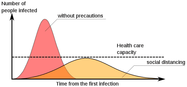
Photo credit: Johannes Kalliauer (3-12-20). Spatial/Social distancing delays the further spread of a virus and preserves the capacity of the health system [Wikimedia Commons / Creative Commons Attribution-Share Alike 4.0 International license]
***